Update: Published Article [September 2015]
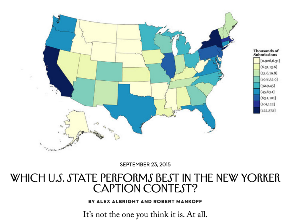
An extenstion of this blog post (using data on submissions and aesthetically improved choropleths!) was published in The New Yorker. See here for the article and here for the relevant R Notebook for replicating the visuals.12
Intro
About 10 years ago The New Yorker began a weekly contest. It was not a contest of writing talents in colorful fiction nor of investigative prowess in journalism, instead it was a contest of short and sweet humor. Write a caption for a cartoon, they said. It’ll be fun, they said. This will help our circulation, the marketing department said. Individuals like me, who back at age 12 in 2005 believed The New Yorker was the adult’s version of Calvin and Hobbes that they most enjoyed in doctors’ waiting rooms, embraced the new tradition with open arms.
Now, 10 years later, approximately 5,372 captions are submitted each week, and just a single winner is picked. Upon recently trying my own hand (and failing unsurprisingly given the sheer magnitude of competing captions) at the contest, I wondered, who are these winners? In particular, since The New Yorker always prints the name and place of residence of the caption contest winner, I wondered, what’s the geographical distribution of these winners?
In order to answer this question, I used my prized subscriber access to the online Caption Contest archive. This archive features the winning caption for each week’s cartoon (along with two other finalist captions) and the name/place of residence of the caption creator. (The archives also feature all other submitted captions–which is super interesting from a machine learning perspective, but I don’t focus on that in this piece.) So, I snagged the geographic information on the past 10 years of winners and went with it.
The basics
For this analysis, I collected information on the first 466 caption contests–that is, all contests up to and including the following:
Before getting into the meat of this discussion, it is worth noting the structure of the contest as well as the range of eligible participants. See this quick explanation from The New Yorker:
Each week, we provide a cartoon in need of a caption. You, the reader, submit your caption below, we choose three finalists, and you vote for your favorite… Any resident of the United States, Canada (except Quebec), Australia, the United Kingdom, or the Republic of Ireland age eighteen or older can enter or vote.
Thus, the contest consists of two rounds; one in which the magazine staff sift through thousands of submissions and pick just three as well as one in which the public votes on the ultimate winner out of the three finalists. Furthermore, the contest is open to residents outside the United States–a fact that is easy to forget when considering how often individuals from other countries actually win. Out of 466 caption contest winners, only 12 are from outside the United States–2 from Australia, 2 from British Columbia (Canada), and 8 from Ontario (Canada). Though they are allowed to compete, no one from the United Kingdom, or the Republic of Ireland has ever won. In short, 97.85% of caption contest winners are from the U.S.
Moving to the city-level of geography, it is unsurprising that The New Yorker Caption Contest is dominated by, well, New Yorkers. New York City has 62 wins, meaning New Yorkers have won 13.3% of the contests. In order to fully understand how dominant this makes New York consider the fact that the city with the next most caption contests wins is Los Angeles with a mere 18 wins (3.9% of contests). The graphic below depicting the top 8 caption contest cities further highlights New York’s exceptionalism:

The geographic distribution: a state-level analysis
While both the country- and city-level results are dominated by the obvious contenders (the United States and New York City respectively), the state-level analysis is much more compelling.
In this vein, the first question to address is: which states win the most contests? To answer this, I present the following chrolopeth3 in which the states are divided into five categories of equal size (each category contains 10 states) based on the number of contests won.4 Visualizing the data in this way allows us to quickly perceive areas of the country that are caption-winner-rich as well as caption-winner-sparse:

This visualization illustrates that the most successful caption contest states are either east coast or west coast states, with the exception of Illinois (due to Chicago’s 16 wins). The most barren section of the country is unsurprisingly the center of the country. (In particular, Idaho, Kansas, North/South Dakota, West Virginia, and Wyoming have never boasted any caption contest winners.)
While using quantiles to classify the data into ranges is helpful, it gives us an overly broad last category–the darkest blue class contains states with win totals ranging from 14 to 85. If we want to zoom in and compare the states within this one category, we can pivot to a simple bar chart for precision’s sake. The following graph presents the number of contests won among the top ten states:

New York and California are clearly the most dominant states with 85 and 75 wins respectively, which is to be expected considering how populous the two are. If we were to take into account the population size of a given state that would most definitely yield a superior metric in terms of how well each state does in winning the contest. (It would also be interesting to take into account the number of New Yorker subscribers by state, but I haven’t been able to get a hold on that data yet, so I am putting a pin in that idea for now.)
Therefore, I normalize these counts by creating a new metric: number of caption contests won per one million state residents. In making this change, the map colors shift noticably. See the following chrolopeth for the new results:

Again, the last category is the one with the broadest range (2.425 to 7.991 wins per million residents). So, once more, it is worth moving away from cool, colorful chropleths and towards the classical bar chart. In comparing the below bar graph with the previous one, one can quickly see the difference made in normalizing by population:

For one, the once dominant New York falls behind new-arrivals Vermont and Rhode Island while the similarly previously dominant California is no where to be seen! Other states that also lose their place among the top ten are: Illinois, New Jersey, and Pennsylvania. Meanwhile, the four new states in this updated top ten are: Alaska and New Hampshire as well as the previously mentioned Rhode Island and Vermont. Among these four new arrivals, Vermont stands clearly ahead of the pack with approximately 8 caption contest wins per million residents.
The high counts per million for states like Vermont and Rhode Island suggest a relationship that many were likely considering throughout this entire article–isn’t The New Yorker for liberals? Accordingly, isn’t there a relationship between wins per million and liberalness?
Those damn liberal, nonreligious states
Once we have normalized caption contest wins by population, we still have not completely normalized states by their likeliness to win the contest. This is due to the fact that there is a distinct relationship between wins per million residents and evident political markers of The-New-Yorker-types. In particular, consider Gallup’s State of the States measures of "% liberal" and "% nonreligious." First, I present the strong association between liberal percentages and wins per million:

Source: New Yorker Caption Contest Archive; Tool: ggplot2 package in R.
The above is a scatterplot in which each point is a state (see the small state abbreviation labels) and the blue line is a linear regression line (the shaded area is the 95% confidence region) fit to the data. The conclusion is unmistakable; states that are more liberal tend to win more contests per million residents. Specifically, the equation for the linear regression line is $winspermillion = -3.13 + 0.22(pctliberal)$.
This means that a 1 percentage point increase in the liberal percentage is associated with an increase of 0.22 captions per million. The $R^2$5 is 0.364, meaning that 36.4% of response variable variation is explained by this simple model. (The standard error on the coefficient attached to pct_liberal is only 0.04, meaning the coefficient is easily statistically significant at the 0.1% level).
Also strong is the association between nonreligious percentages and wins per million, presented in the graph below:

This plot is very similar to the previous one, most definitely because states with high liberal percentages are likely to have high nonreligious percentages as well. The linear regression line that is fit for this data is $winspermillion = -1.37 + 0.09(pctnonreligious)$.
The relevant conceptual interpretation is that a 1 percentage point increase in the nonreligious percentage is associated with an increase of 0.09 captions per million. The $R^2$ for this model is 0.316, so 31.6% of response variable variation is explained by the model. (Again, the coefficient of interest–this time the coefficient attached to $pctnonreligious$, is statistically significant at the 0.1% level.)
These two graphs are simple illustrations of the statistically significant relationships between wins per million and two political markers of The New Yorker readership. In order to better understand the relationship between these variables, one must return to the structure of the contest…
The mechanism behind the success of liberal, nonreligious states
The caption contest is broken chronologically into three phases:
- individuals submit captions
- three captions are selected as finalists by magazine staff
- the public votes on their favorite caption
It seems most likely that the mechanism behind the success of liberal, nonreligious states lies in the first phase. In other words, liberal, nonreligious people are more likely to read The New Yorker and/or follow the caption contest. (Its humor is unlikely to resonate with the intensely religious or socially conservative.) Therefore, the tendency towards wins for liberal, nonreligious states is mostly a question of who chooses to participate.
It could also be the case that at least a part of the mechanism behind these states’ successes lies in phases (2) or (3). If a piece of this mechanism was snuggled up in phase 2, that would mean The New Yorker staff is inclined due to an innate sense of liberal humor to pick captions from specific states.6 If the mechanism were instead hidden within the third phase, this would mean voters tend to vote for captions created by people from more nonreligious and liberal states in the country. One interesting element to note is that voters can see the place of residence of a caption creator–though I highly doubt this influences peoples’ voting choices, it is possible that regional favoritism is a factor (e.g., New Yorkers like to see other New Yorkers win and, therefore, the large number of New Yorker voters pushes the New Yorker caption submissions to win).
In order to better investigate the mechanism behind the success of nonreligious, liberal states, one needs access to the geographic data of all submissions…or, at least the data on the number of subscribers per state. Though one can submit to the contest without a subscription, the latter measure could still be used as a credible proxy for the former since the number of people who submit to the contest in a state is likely proportional to the number of subscribers in the state.
A thank you note
Thanks to my family for giving me a subscription to The New Yorker this past holiday season in a desperate attempt to help me become less of a philistine. My sincerest apologies that I have focused more on the cartoons than all those chunks of words that mark space in between.
Code
All data and R scripts needed to recreate all types of visualizations in this article (choropleths, bar charts, and scatterplots with linear regression lines) are available on my “NewYorker” Github repo).
-
Many, many thanks to Bob Mankoff for giving me access to troves of data and humoring (literally) my data visualization pitch. ↩︎
-
Thanks to Sarah Michael Levine for using her QGIS knowledge to help me tame maps of the US. ↩︎
-
I use the choroplethr package in R for all choropleths in this post. ↩︎
-
This method uses quantiles to classify the data into ranges, however, there are other methods one could use as well. ↩︎
-
In this case, the
$R^2$is the same as the basic correlation coefficient$r^2$between$winspermillion$and$pctliberal$since there is just one explanatory variable in the regression. ↩︎ -
Yet, since most submissions are probably already from liberals, this seems unlikely–though maybe the reverse happens as the magazine attempts to foster geographic diversity by selecting captions from a broader range of locations? I don’t think that’s part of the caption selection process, but it could be relevant to the aforementioned mechanism if it were. ↩︎