Preface
This is the first in a series of posts that I am putting together in partnership with Edusalsa, an application based at Stanford that seeks to improve how college students explore and choose their courses. Our goal in these posts is to take advantage of the unique data collected from students’ use of the application in order to learn more about how to model and discuss the accumulation and organization of knowledge within the Stanford community as well as within the larger, global education space. (You can read the post here too.)
Course Syllabus
You are frozen in line. This always happens. You don’t know whether to pick the ENGLISH, PHYSICS with double CS combo that you always order or whether to take a risk and try something new. There are thousands of other options; at least a hundred should fit your strict requirements and picky tastes…Hey, maybe you’d like a side of FRENCH! But now you don’t even know what you should get on it; 258, 130, or 128. You are about to ask which of the three goes best with ENGLISH 90 when you wake up.
You realize you missed lunch… and you need to get out of the library.
Complex choices, those with a large number of options (whether in a deli or via online course registration), often force individuals to make choices haphazardly. In the case of academics, students find themselves unable to bulldoze their way through skimming all available class descriptions, and, accordingly, pick their classes with the help of word of mouth and by simply looking through their regular departments offerings. However, it is undoubtably the case that there are ways to improve matching between students and potential quarterly course combinations.
To better understand how to improve the current course choice mechanism, one must first better understand the Stanford education space as well as the myriad of objects (courses, departments, and grades) and actors (students and Professors) that occupy it. The unique data collected from students’ use of Edusalsa provides an opportunity to do just this. In this post, organized in collaboration with the Edusalsa team, we will use this evolving trove of data to discuss three overarching questions:
- How can we measure the interest surrounding, or the popularity of, a course/department? (In conjunction with that question, what should we make of enrollment’s place in measuring interest or popularity?)
- What is the grade distribution at Stanford, on the whole as well as on the aggregate school-level?
- How do students approach using new tools for course discovery?
1. How can we measure the interest surrounding, or the popularity of, a course/department?
One of the first areas of interest that can be examined with the help of Edusalsa’s data is Stanford student interest across courses and departments. Simply put, we can use total views on Edusalsa, aggregated both by course and by department, as a proxy for for interest in a course/popularity of a course.1 In order to visualize the popularity of a collection of courses and departments, we use a treemap structure to illustrate the relative popularities of two sets of academic objects; (1) all courses that garnered at least 20 views, and (2) all departments that garnered at least 30 views:2

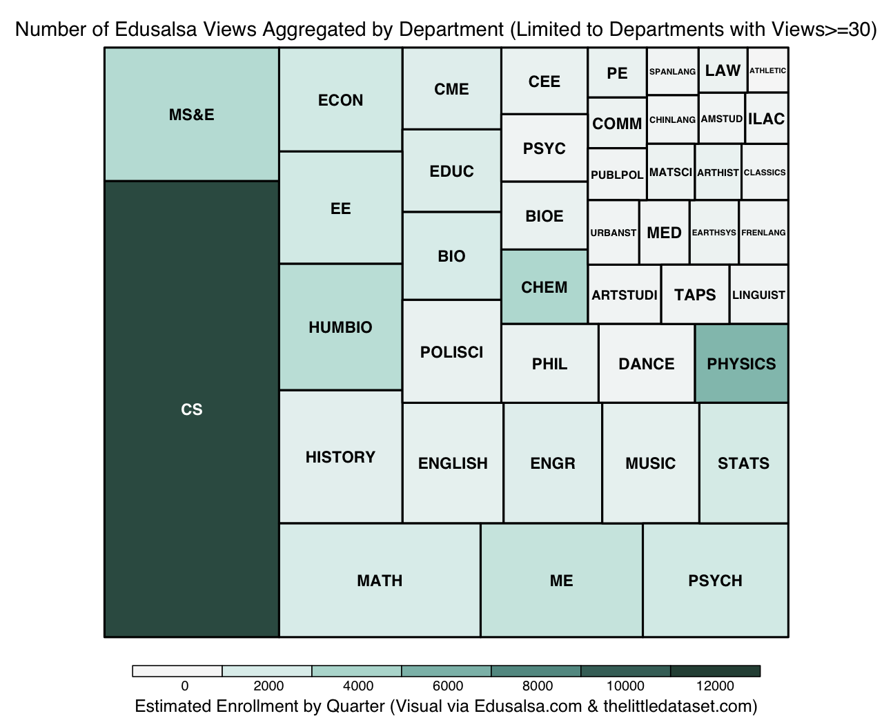
The size of the rectangles within the treemap corresponds to the number of endpoints while the darkness of the color corresponds to the estimated enrollment by quarter for classes and entire departments. We notice that, at the course-level, the distribution of colors throughout the rectangles seems disorganized over the size dimension. In other words, there does not seem to be a strong relationship between enrollment and views at the course level. On the other hand, from a cursory look at the second graph, the department treemap seems to illustrate that courses with larger aggregate enrollments (that is, the sum of all enrollments for all classes in a given department) have more views.
What should we make of enrollment’s place in measuring interest or popularity?
While these particular treemaps are useful for visually comparing the number of views across courses and departments, they do not clarify what, if any, is the nature of the relationship between enrollment and views for these two subsets of all courses and departments. Due to the treemaps’ analytic shortcomings, we address the legitimacy of our previous intuitions about the relationship by simply regressing views on enrollment at both the course- and department-level. See below for the relevant plot at the course-level:
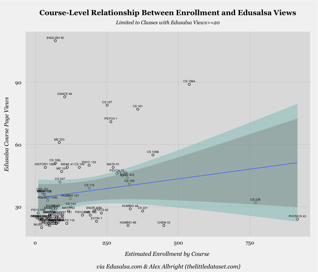
The coefficient on enrollment in the simple linear regression model, represented by the blue line in the above plot, while positive, is not statistically significant. We can also see this is the case when considering the width of the light green area above (the 99% confidence interval) and the more narrow gray area (the 95% confidence interval), as both areas comfortably include an alternative version of the blue regression line for which the slope is 0. The enrollment variable’s lack of explanatory power is further bolstered by the fact that, in this simple regression model framework, enrollment variation only accounts for 1.3% of the variation in views.
We now turn to the department-level, which seemed more promising from our original glance at the association between colors and sizes in the relevant treemap:

In this case, the coefficient on enrollment in this model is statistically significant at the 0.1% level and communicates that, on average, a 1,000 person increase in enrollment for a department is associated with an increase of 65 views on Edusalsa. The strength of the association between enrollment and views is further evidenced by the 95% and 99% confidence intervals. In fact, the explanatory power of the enrollment variable in this context is strong to the point that the model accounts for 53.9% of variation in Edusalsa views.3
Theory derived from the comparison of course-level and department-level relationships
The difference between the strength of enrollment’s relationship with views at the course and at the department level is clear and notable. I believe that this difference is attributable to the vast heterogeneity in interest across courses, meaning there is extreme variance in terms of how much interest a course garners within a given department. Meanwhile, the difference in interest levels that is so evident across courses disappears at the department-level, once all courses are aggregated. This observation potentially serves as evidence of a current course search model in which students rigidly search within specific departments based on their requirements and fields of study, but then break up their exploration more fluidly at the course-level based on what they’ve heard is good or which classes look the most interesting etc. While the students know what to expect from departments, courses can stand out via catchy names or unique concepts in the description.
More possible metrics, and way more colors…
There are a few other metrics beyond views and enrollment that we might be interested in when trying to assess or proxy for interest surrounding a course or department. In order to compare some of these alternative metrics across various departments we present the below heat map, which serves to relatively compare a set of six metrics across the top 15 departments by enrollment size:

While we have discussed enrollment before, I also include number of courses in the second column as an alternative measurement of the size of the department. Rather than defining size by number of people who take classes in the department, this defines size by the number of courses the department offers. The darker greens of CEE, Education, and Law illustrate that these are the departments parenting the most courses.
Another new metric in the above is the fifth column, a metric for number of viewers, which refers the number of unique individuals who visited a course page within a department. The inclusion of this measurement allows us to avoid certain individuals exerting improperly large influence over our measures. For example, one person who visits Economics course pages thousands of times won’t be able to skew this metric though she could skew the views metric significantly. Note that the columns for number of views and number of viewers are very similar, which indicates that, beyond some individuals in EE, departments had individuals viewing courses at similar frequencies.
The last new concept we introduce in the heat map is the notion of normalizing by enrollment, seen in columns four and six, so as to define metrics that take into account the size of the Stanford population that is already involved with these departments. Normalizing views and viewers in this way makes a large impact. Most notably, CS is no longer the dominant department, and instead shares the stage with other departments like Psychology, MS&E, MEE, etc. This normalized measure could be interpreted to proxy for the interest outside of the core members of the department (eg-majors and planned majors), in which case Psychology is certainly looking interesting to those on the outside looking in.
2. What is the grade distribution at Stanford, on the whole as well as on the aggregate school-level?
The second topic that we cover in this post pertains to that pesky letter attached to a course–that is, grades. Our obtained data included grade distributions by course.4 We use this data to build the frequency distribution for all grades received at Stanford. The following histogram illustrates that the most commonly received grade during the quarter was an A while the median grade was an A- (red line) and the mean grade was a 3.57 (blue line):

While this visual is interesting in and of itself since it presents all Stanford course offerings solely by grade outcomes, it would also be meaningful to compare different subsets of the Stanford education space. In particular, we choose to use a similar technique to compare grading distributions across the three schools at Stanford–the School of Humanities & Sciences, the School of Engineering, and the School of Earth, Energy and Environmental Sciences–in order to see whether there is any notable difference across the groups:

The histograms for the three schools present incredibly similar distributions–to the extent that at first I thought I mistakenly plotted the same school’s distribution three times. All three have medians of A- and the means are span a narrow range of 0.08; the means are 3.52, 3.60, and 3.58 for the Humanities & Sciences, Engineering, and Earth Sciences schools, respectively.5
3. How do students approach using new tools for course discovery?
Since we have discussed views and other metrics both across classes and departments, it is worth mentioning what the Edusalsa metrics look like over individual users. Specifically, we are curious how many times unique users view courses through Edusalsa. In examining this, we are inherently examining the level of “stickiness” of the site and the aggregated view of how users interact with new course tools. In this case, the stickiness level is low, as illustrated below by both (i) a quickly plunging number of unique individuals as the number of course views grows, and (ii) a linear decline of number of unique individuals as the number of course views grows when using a log-log plot.6

The negative linear relationship between the log transformed variables in the second panel (evidenced by the good fit of the above blue line) is indicative of the negative exponential form of the relationship between number of course views and number of unique individuals.7 This simply indicates that, as is the case with most new applications, so-called stickiness is low. It will be interesting to see whether this changes given the new addition of the ability to create an account.
School’s out (for summer)
Our key insights in this post lie in the depths of the first section, which discussed
evidence of a current course search model in which students rigidly search within specific departments based on their requirements and fields of study, but then break up their exploration more fluidly at the course-level
With evolving data collection, we will continue to use Edusalsa data in order to learn more about the current course search model as well as the specific Stanford education space. Future steps in this line of work will include analyzing the dynamics between departments and the courses that populate them using network analysis techniques. (There is a slew of possible options on this topic: mapping out connections between departments based on overlap in the text of course descriptions, number of cross-listings, etc.)
There is ample room for tools in the education space to help students search across conventional departments, rather than strictly within them, and understanding the channels that individuals most naturally categorize or conceptualize courses constitutes a large chunk of the work ahead.
Data/Code
All datasets and R scripts necessary to recreate these visuals are available at my “edusalsa” Github repo!
Update: Code fix [April 2016]
Thanks to Stuart Rojstaczer for finding an error in my grade distribution histograms. Just fixed them and uploaded the fixed R script as well. Such is the beauty of internet feedback!
-
Edusalsa views by course refers to the number of times an individual viewed the main page for a course on the site. Technically, this is when the
data.urlthat we record includes the suffix/course?c=DEPT&NUMwhereDEPTis the department abbreviation followed by the number of the course within the department. Views aggregated by department is equivalent to the sum total of all views for courses that are under the umbrella of a given department. ↩︎ -
We only illustrate courses with at least 20 views and departments with at least 30 views in order that they will be adequately visible in the static treemap. Ideally, the views would be structured in an interactive hierarchical tree structure in which one starts at the school level (Humanities & Sciences, Engineering, Geosciences) and can venture down to the department level followed by the course level. ↩︎
-
Though it might seem as though Computer Science is an outlier in this dataset whose omission could fundamentally alter the power of the simple regression model, it turns out even after omitting CS the coefficient on enrollment remains significant at the 0.1% level while the
$R^2$remains high as well at approximately 0.446. ↩︎ -
The grade distribution data is self-reported by Stanford students over multiple quarters. ↩︎
-
While the distributions are very similar aggregated over the school level, I doubt they would be as similar at the smaller, more idiosyncratic department-level. This could be interesting to consider across similar departments, such as ME, EE, CEE, etc. It could also be interesting to try and code all classes at Stanford as “techie” or “fuzzy” a la the quintessential Stanford student split and see whether those two grade frequency distributions are also nearly identical. ↩︎
-
We found that ID codes we use to identify individuals can change over people in the long-run. We believe this happens rarely in our dataset, however, it is worth noting nonetheless. Due to this caveat, some calculations could be over- or underestimates of the their true values. For instance, the low stickiness for Edusalsa views could be overestimated as some of the users who are coded as distinct people are the same. Under the same logic, in the heat table, the number of viewers could be an overestimate. ↩︎
-
The straight line fit in a log-log plot indicates a monomial relationship form. A monomial is a polynomial with one term–i.e.
$y=ax^n$– appear as straight lines in log-log plots such that$n$and$a$correspond to the slope and intercept, respectively. ↩︎