Intro
I have officially finished applying for my PhD. While the application process included many of the same elements that I had previously encountered as a fresh-faced1 17-year-old (think standardized testing without the #2 pencils and lots more button clicking), I am no longer applying as a (relatively) blank slate–a future liberal arts student who will float and skip between disciplines until being neatly slotted into a major. Instead, we PhD applicants have already zeroed in on a particular area of study–in my case, economics. Consequently, each PhD discipline is unlikely to exhibit the same carefully crafted demographics boasted in the pie charts that plaster undergraduate brochures across the country to provide tangible evidence for optimistic, bolded statements about diversity. In formulating responses to a slew of university-specific prompts about diversity in “the sciences,” I grew curiouser and curiouser about two particular questions: What do demographic compositions look like across various PhD disciplines in the sciences? & Have demographic snapshots changed meaningfully over time?
As I continued working to imbue a sense of [academic] self into PDFs composed of tightly structured Times New Roman 12 point font, I repeatedly found myself at the NSF open data portal, seeking to answer the aforementioned questions. However, I would then remind myself that, despite my organic urge to load rows and columns into R Studio, I should be the responsible adult (who I know I can be) and finish my applications before running out to recess. Now that the last of the fateful buttons have been clicked (and a sizable portion of my disposable income has been devoured by application fees and the testing industrial complex), I’m outside and ready to talk science!2
NSF data and sizes of “the sciences”
In this post, I am focusing on the demographics of science PhD degrees awarded as they pertain to citizenship and race/ethnicity, but not gender. In an ideal world, I would be able to discuss the compositions of PhD fields as broken into race/ethnicity-gender combinations, however, the table that includes these types of combinations for US citizens and permanent residents (Table 7-7) only provides the numbers for the broader categories rather than for the desired discipline-level. For instance, social science numbers are provided for 2002-2012 without specific numbers for economics, anthropology, etc. This approach, therefore, would not allow for an investigation into the main topic of interest, which is the demographic differences between the distinct disciplines–there is too much variety within the larger umbrella categories to discuss the fields’ compositions in this way. Therefore, I limit this discussion to demographics with respect to citizenship and race/ethnicity and, accordingly, use Table 7-4 “Doctoral degrees awarded, by citizenship, field, and race or ethnicity: 2002–12” from the NSF Report on Women, Minorities, and Persons with Disabilities in Science and Engineering3 as my data source.
Before getting into the different PhD science fields and their demographics, it’s worth noting the relative sizes of these disciplines. The following treemap depicts the relative sizes of the sciences as defined by NSF data on doctoral degrees awarded in 2012:

The size of each squarified rectangle represents the number of degrees awarded within a given field while the color denotes the field’s parent category, as defined by the NSF. (Note that some studies are, in fact, their own parent categories. This is the case for Biological Sciences, Psychology, Computer Sciences, and Agricultural Sciences.) In the upcoming discussion of demographics, we will first discuss raw numbers of degrees earned and the relevant demographic components but will then pivot towards a discussion of percentages, at which point remembering the differences in size will be particularly helpful in piecing together the information into one cohesive idea of the demographics of “the sciences.”4
A decade of demographic snapshots: PhD’s in the sciences
The NSF data specifies two levels of information about the doctoral degrees awarded. The first level identifies the number of degree recipients who are US citizens or permanent residents as well as the number who are temporary residents. Though “[t]emporary [r]esident includes all ethnic and racial groups,” the former category is further broken down into the following subgroups: American Indian or Alaska Native, Asian or Pacific Islander, Black, Hispanic, Other or unknown, and White. In our first exploration of the data, we specify the raw number of degrees awarded to individuals in the specific ethnic and racial categories for US citizens and permanent residents as well as the number awarded to temporary residents. In particular, we start the investigation with the following series of stacked area charts (using flexible y-axes given the vastly different sizes of the disciplines):

In this context and for all following visualizations, the red denotes temporary residents while all other colors (the shades of blue-green and black) are ethnic and racial subsets of the US citizens and permanent residents. By illustrating the raw numbers, this chart allow us to compare the growth of certain PhD’s as well as seeing the distinct demographic breakdowns. While overall the number of science PhD’s increased by 39% from 2002 to 2012, Astronomy, Computer Science, Atmospheric sciences, and Mathematics and statistics PhD’s clearly outpaced other PhD growth rates with increases of 143%, 125% 84%, and 80%, respectively. Meanwhile, the number of Psychology PhD’s actually decreased from 2002 to 2012 by 8%. While this was the only science PhD to experience a decline over the relevant 10-year period, a number of other disciplines grew at modest rates. For instance, the number of Anthropology, Sociology, and Agricultural Sciences PhD’s experienced increases of 15%, 16%, and 18% between 2002 and 2012, which pale in comparison to the vast increases seen in Astronomy, Computer Science, Atmospheric sciences, and Mathematics and statistics.
While it is tempting to use this chart to delve into the demographics of the different fields of study, the use of raw numbers renders a comprehensive comparison of the relative sizes of groups tricky. For this reason, we shift over to visualizations using percentages to best get into the meat of the discussion–this also eliminates the need for different y-axes. In presenting the percentage demographic breakdowns, I supply three different visualizations: a series of stacked area graphs, a series of nightingale graphs (essentially, polar stacked bar charts), and a series of straightforward line graphs, which despite being the least exciting/novel are unambiguous in their interpretation:
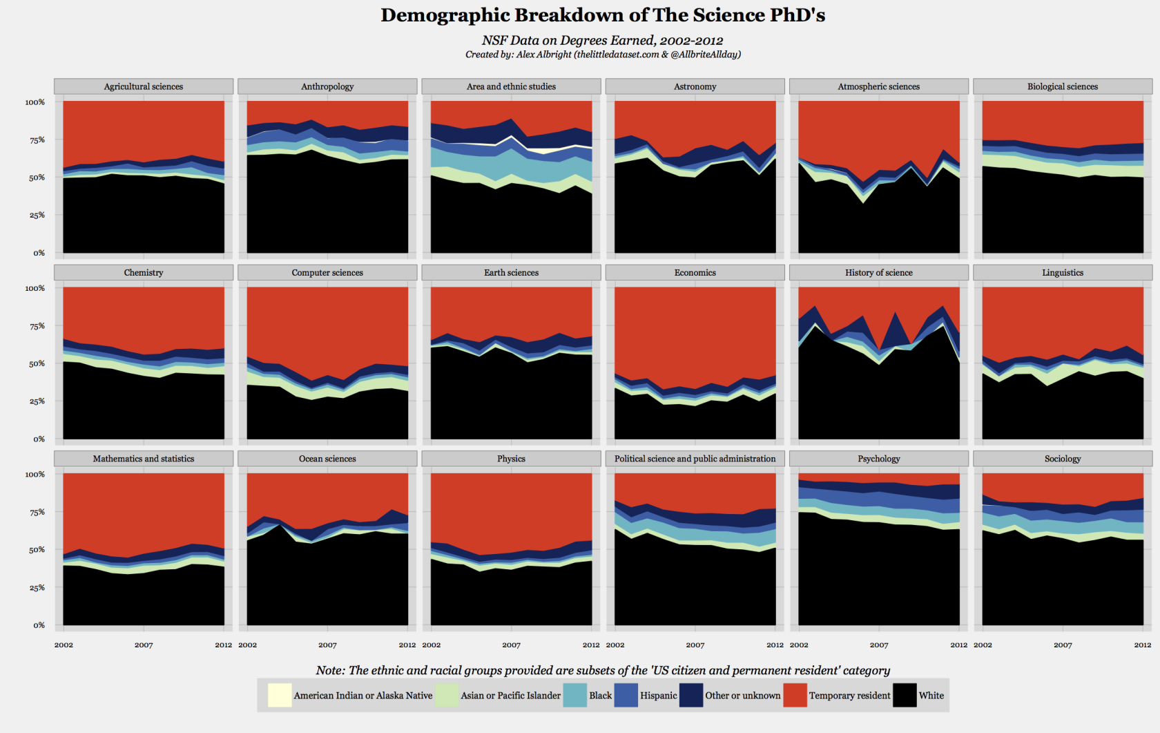


One of my main interests in these graphs is the prominence of temporary residents in various disciplines. In fact, it turns out that Economics is actually quite exceptional in terms of its percentage of temporary residents, which lingers around 60% for the decade at hand and is at 58% for 2012. (In 2012, out of the remaining 42% that are US citizens or permanent residents, 70% are white, 11% are asian or pacific islander, 3% are black, 3% are hispanic, 0% are american indian or alaskan native, and 13% are other or unknown.) Economics stands with Computer science, Mathematics and statistics, and Physics as one of the four subjects in the sciences for which temporary residents made up a higher percentage of the PhD population than white US citizens or permanent residents consistently from 2002 to 2012. Furthermore, Economics is also the science PhD with the lowest percentage of white US citizens and permanent residents–that is, a mere 30%. In this sense, the field stands out as wildly different in these graphs from its social science friends (or, more accurately, frenemies). On another note, it is also not hard to immediately notice that Psychology, which is not a social science in the NSF’s categorization, is so white that its nightingale graph looks like an eye with an immensely overly dilated pupil (though anthropology is not far behind on the dilated pupil front).
Also readily noticeable is the thickness of the blue hues in the case of Area and ethnic studies–an observation that renders it undeniable that this subject is the science PhD with the highest percentage of non-white US citizens and permanent residents. Following this discipline would be the other social sciences Anthropology, Sociology, and Political science and public administration, as well as the separately categorized Psychology. However, it is worth noting that the ambiguity of the temporary residents’ racial and ethnic attributes leaves much of our understanding of the prominence of various groups unclear.
Another focal point of this investigation pertains to the time dimension of these visuals. When homing in on the temporal aspect of these demographic snapshots, there is a discouraging pattern–a lack of much obvious change. This is especially highlighted by the nightingale graphs since the polar coordinates allow the 2012 percentages to loop back next to the 2002 percentages and, thus, facilitate for a simple start-to-end comparison. In most cases, the two points in time look incredibly similar. Of course, this does not necessarily mean there has been no meaningful change. For instance, there have been declines in the percentage of white US citizens and permanent residents in the subjects Area and ethnic studies, Psychology, Sociology, Anthropology, and Political science and public administration, which have then been offset by increases in other groups of individuals. However, the picture is incredibly stagnant for most of the disciplines, especially the hard sciences and the unusually quantitative social science of economics. In pairing the stagnant nature of these demographic snapshots with consistent calls for greater faculty diversity in the wake of campus protests, it is clear that there is a potential bottleneck since such lagging diversity in PhD disciplines can directly contribute to a lack of diversity at the faculty-level.
Endnote
When the public discusses the demographics and diversity of “the sciences,” 1.5 dozen disciplines are being improperly blended together into generalized statements. To better understand the relevant dynamics, individuals should zero in on the discipline-level rather than refer to larger umbrella categories. As it turns out according to our investigation, the demographic breakdowns of these distinct subjects are as fundamentally different as their academic methodologies–methodologies which can be illustrated by the following joke that I can only assume is based on a true story:
As a psychological experiment, an engineer, a chemist, and a theoretical economist are each locked in separate rooms and told they won’t be released until they paint their entire room. They are each given a can of blue paint which holds about half the paint necessary to paint the room and then left alone. A few hours later the psychologist checks up on the three subjects.
(1) The engineer’s walls are completely bare. The engineer explains that he had worked out that there wasn’t enough paint to cover all the walls so he saw no point in starting.
(2) The chemist’s room is painted in faded, streaky blue. “There wasn’t enough paint, so I diluted it,” she explains.
(3) In the economist’s room, the floor and the ceiling are completely blue, and there’s a full can of paint still sitting on the floor. The experimenter is shocked and asks how the economists managed to paint everything. The economist explains, “Oh, I just painted the rational points.”
And with an unwavering appreciation for that bit, I hope to be one of the ~20-30 (who knows?) % of white US citizens/permanent residents in the next economics PhD cohort.
PS: Happy 2016 everyone!
Code/Data
Data and R scripts necessary to replicate visualizations are now up on my github! See the “NSF_Demographics” repo.
Further directions for work
- Create gif of treemap using years 2002-2012 to replace the static version for just 2012 Or use a slider via some D3 magic
- Follow-up by comparing the gender compositions (Would fit nicely with this NPR story from last year
- Look into the development and change history of the US Office of Management and Budget for racial and ethnic categories (I’m curious as to the timeline of changes and how categorization changes affect our available data)
-
I had yet to take a driving test at a DMV. I did this successfully at age 21. But, I will not drive your car. ↩︎
-
The NSF divides subjects up into S&E (science and engineering) and non-S&E categories. In this context, I am only discussing the subjects that fall under the umbrella of science. It would be simple to extend the approach and concept to the provided numbers for engineering. ↩︎
-
This table explains that the exact source for this information is: National Science Foundation, National Center for Science and Engineering Statistics, special tabulations of U.S. Department of Education, National Center for Education Statistics, Integrated Postsecondary Education Data System, Completions Survey, 2002–12. ↩︎
-
In particular, the tiny size of the group of History of Science PhD’s allows for much more variability year-to-year in terms of demographics. Only 19-34 degrees were given out on an annual basis from 2002-2012. In this case, size of the program is responsible for the wildly evident changes in demographic composition. ↩︎