Intro
This past Wednesday, after watching Hillary Clinton slow-motion strut into the Broad City universe and realizing that this election has successfully seeped into even the most intimate of personal rituals, I planned to go to sleep without thinking any more about the current presidential race. However, somewhere in between Ilana’s final “yas queen” and hitting the pillow, I saw David Wasserman’s FiveThirtyEight article “Trump Voters’ Aversion To Foreign-Sounding Names Cost Him Delegates.”
Like many readers I was immediately drawn to the piece’s fundamentally ironic implication that Trump could have lost delegates in Illinois due to the very racial resentment that he espouses and even encourages among his supporters. The possibility that this could be more deeply investigated was an energizing idea, which had already inspired Evan Soltas to do just that as well as make public his rich-in-applications-and-possibilities dataset. With this dataset in hand, I tried my hand at complementing the ideas from the Wasserman and Soltas articles by building some visual evidence. (Suffice it to say I did not end up going to sleep for a while.)
To contribute to the meaningful work that the two articles have completed, I will first quickly outline their scope and conclusions, and then present the visuals I’ve built using Soltas’ publicly available data. Consider this a politically timely exercise in speedy R scripting!
Wasserman’s FiveThirtyEight piece & Soltas’ blog post
In the original article of interest, Wasserman discusses the noteworthy Illinois Republican primary. He explains that,
Illinois Republicans hold a convoluted “loophole” primary: The statewide primary winner earns 15 delegates, but the state’s other 54 delegates are elected directly on the ballot, with three at stake in each of the state’s 18 congressional districts. Each campaign files slates of relatively unknown supporters to run for delegate slots, and each would-be delegate’s presidential preference is listed beside his or her name.
Given that the delegates are “relatively unknown,” one would assume that delegates in the same district who list the same presidential preference would earn similar numbers of votes. However, surprisingly, Wasserman found that this did not seem to be the case for Trump delegates. In fact, there is a striking pattern in the Illinois districts with the 12 highest vote differentials: “[i]n all 12 cases, the highest vote-getting candidate had a common, Anglo-sounding name” while “a majority of the trailing candidates had first or last names most commonly associated with Asian, Hispanic or African-American heritages.” These findings, while admittedly informal, strongly suggest that Trump supporters are racially biased in their delegate voting behaviors.
Soltas jumps into this discussion by first creating dataset on all 458 people who ran for Illinois Republican delegate spots. He merges data on the individuals’ names, districts, and candidate representation with a variable that could be described as a measure of perceived whiteness – the non-Hispanic white percentage of the individual’s last name, as determined from 2000 US Census data. The inclusion of this variable is what makes the dataset so exciting (!!!) since, as Soltas explains, this gives us an “objective measure to test the phenomenon Wasserman discovered.”
The article goes on to confirm the legitimacy of Wasserman’s hypothesis. In short, “Trump delegates won significantly more votes when they had “whiter” last names relative to other delegates in their district” and this type of effect does not exist for the other Republicans.
Visual evidence time
I now present a few visuals I generated using the aforementioned dataset to see Soltas’ conclusions for myself. First things first, it’s important to note that some grand underlying mechanism does not jump out at you when you simply look at the association between perceived whiteness and vote percentage for all of Trump’s Illinois delegates:

The above graph does not suggest any significant relationship between these two numbers attached to each individual delegate. This is because the plot shows delegates across all different districts, which will vote for Trump at different levels, but compares their absolute variable levels. What we actually care about is comparing voting percentages within the same district, but across different individuals who all represent the same presidential hopeful. In other words, we need to think about the delegates relative to their district-level context. To do this, I calculate vote percentages and whiteness measures relative to the district: the percentage point difference between a Trump delegate’s vote/whiteness percentage and the average Trump delegate vote/whiteness percentage in that district.1

Now that we are measuring these variables (vote percentage and whiteness measure) relative to the district, there is a statistically significant association beyond even the 0.1% level.2 In the end, the interpretation of the simplistic linear regression is that a 10 percentage point increase in a Trump delegate’s perceived whiteness relative to the district yields a 0.12 percentage point increase in the delegate’s vote percentage relative to the district.3
The last dimension of this discussion requires comparing Trump to the other Republican candidates. Given the media’s endless coverage of Trump, I would not have been surprised to learn that this effect impacts other campaigns but just was never reported. But, Wasserman and Soltas argue that this is not the case. Their claims are further bolstered by the following visual, which recreates the most recent Trump plot for all 9 candidates who had sufficient data4:
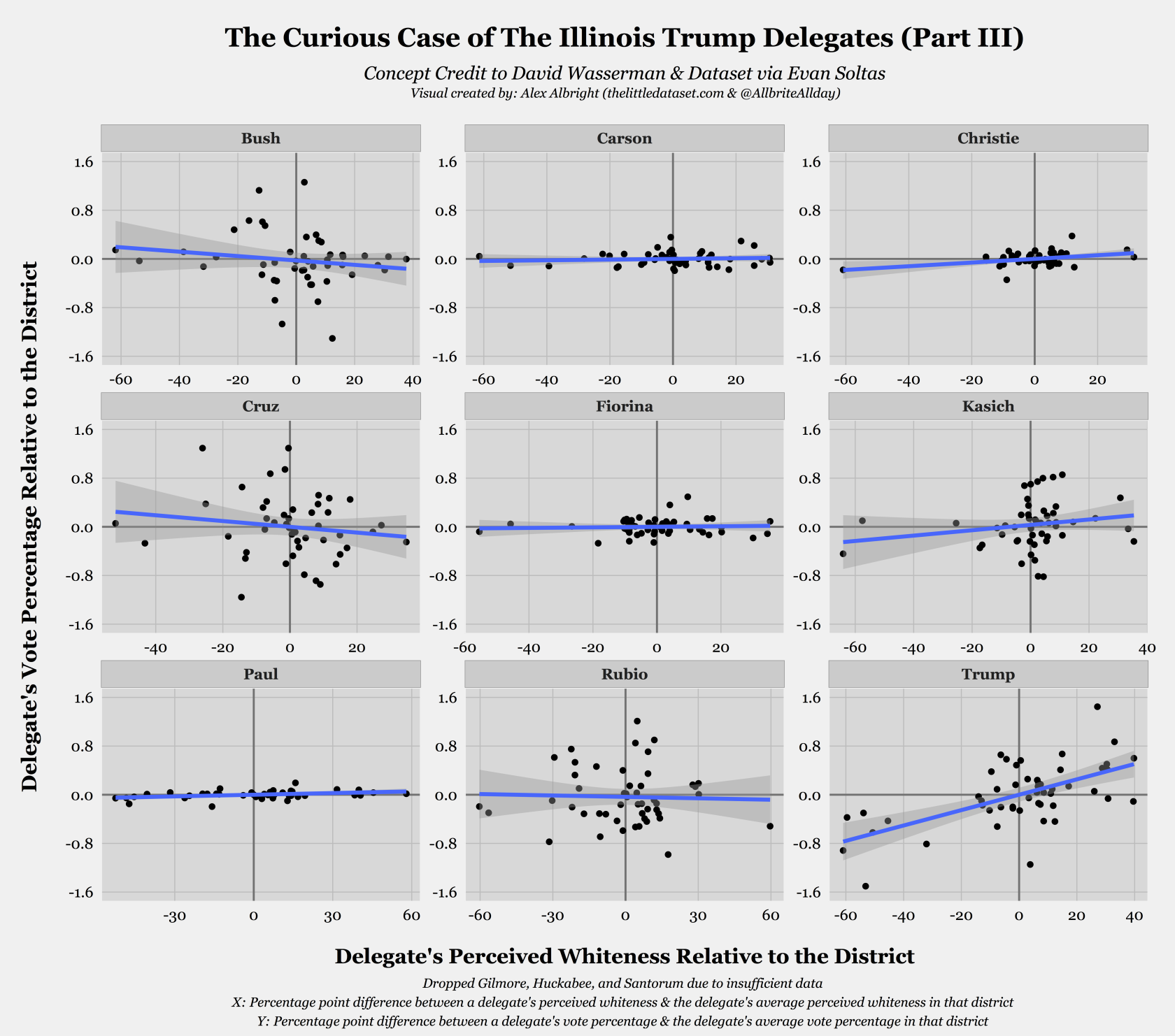
It should be immediately clear that Trump is the only candidate for whom there is a positive statistically significant association between the two relative measures. While Kasich has an upward sloping regression line, the corresponding 95% confidence interval demonstrates that the coefficient on relative perceived whiteness is not statistically significantly different from 0. Employing the whiteness measure in this context allows us to provide quantitative evidence for Wasserman’s original intuition that this effect is unique to Trump–thus, “lend[ing] credibility to the theory that racial resentment is commonplace among his supporters.”
The role of perceptions of whiteness
Wasserman’s article has incited an outpouring of genuine interest over the past few days. The fascinating nature of the original inquiry combined with Soltas’ integration of a perceived whiteness measure into the Illinois delegate dataset provides a perfect setting in which to investigate the role racial resentment is playing in these particular voting patterns, and in the election on the whole.
Code
My “illinois_delegates”" Github repo has the R script and csv file necessary to replicate all three visuals!
We know data, we have the best data.
-
Suggestions welcome on different ways of doing this for visualization’s sake! ↩︎
-
The simple linear regression
Y~Xin this case yields a t-statistic of 5.4! ↩︎ -
I’m curious if people think there is a better way to take district levels into account for these visuals – let me know if you have any thoughts that yield a simpler coefficient interpretation! ↩︎
-
This excludes Gilmore, Huckabee, and Santorum. ↩︎