Intro
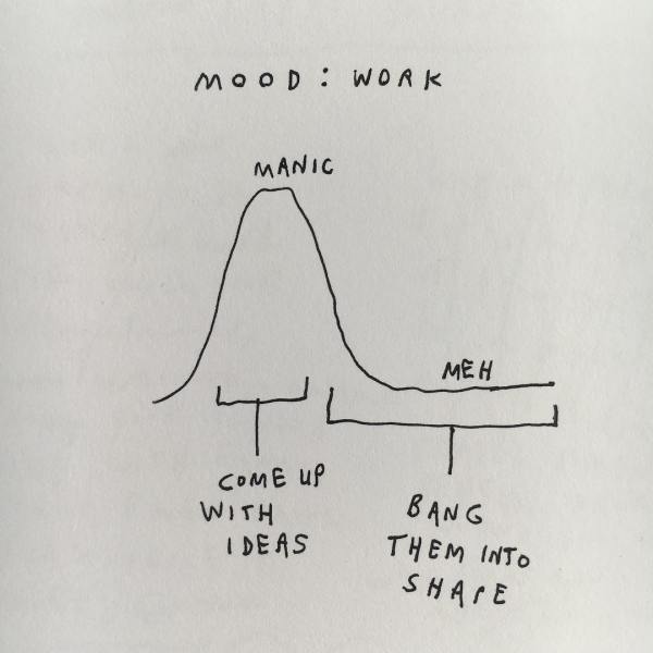
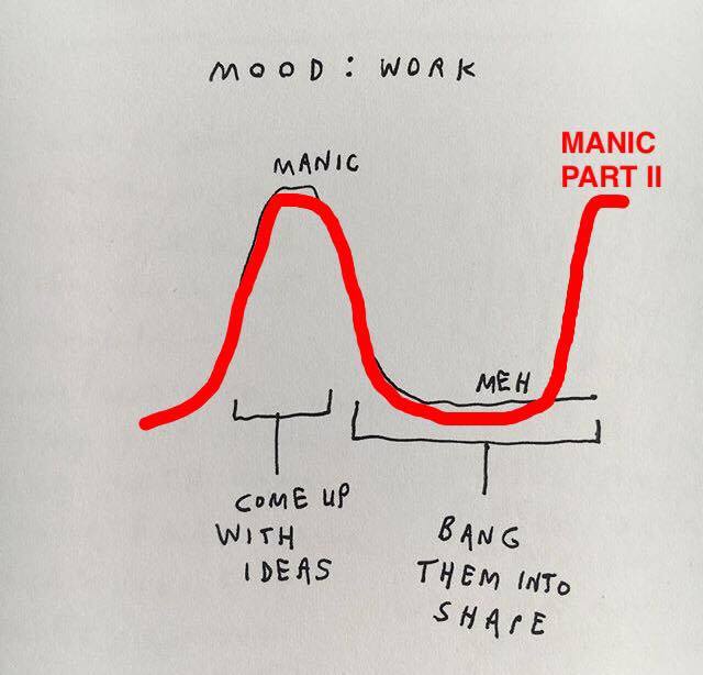
There is a collection of notes that accompanies me throughout my day, slipped into the deep pockets of my backpack. The collection consists of small notebooks and post-its featuring sentence fragments written in inky Sharpie or scratched down frantically using some pen that was (of course) dying at the time. Ideas, hypotheses, some jokes. Mostly half baked and sometimes completely raw. Despite this surplus of scribbles, I often struggle when it comes acting on the intention of the words that felt so quick and simple to jot down… In fact, I often feel myself acting within the confines of this all too perfect graphical representation of project development:
One topic of interest – comparisons of charter and district public schools – has been on my (self-imposed) plate for over a year now. The topic was inspired by a documentary webseries that a friend actually just recently completed.1 Given that she is currently wrapping up this long-term project, I am doing the same for my related mini-project. In other words, some post-its are officially being upgraded to objects on the internet.
To quote the filmmakers, “Charter Wars is an interactive documentary that examines the ideologies and motivations driving the charter school debate in Philadelphia.” Ah, yes, charter schools… a handful of slides glided by me on the topic in my morning Labor Economics class just this past Wednesday.2 However, despite the mention of these papers, I am not going to use this space in order to critique or praise rigorous academic research on the subject. Instead, I will use this space as a playground for the creation of city open data visualizations. Since Sivahn focuses her Charter Wars project on Philadelphia, I decided to do the same, which turned out to be a great idea since OpenDataPhilly is a joy to navigate, especially in comparison to other city data portals. After collecting data of interest from their site, I used ggplot2 in R (praise Hadley!) to create two visualizations comparing district and charter schools in the city.
Think of this post as a quasi-tutorial inspired by Charter Wars; I’ll present a completed visual and then share the heart of the code in the text with some brief explanation as to the core elements therein.
Visualization #1: Mapping out the city and schools
First things first, I wanted to map the location of public schools in the city of Philadelphia. Open data provides workable latitude and longitudes for all such schools, so this objective is entirely realizable. The tricky part in mapping the schools is that I also had to work with shape files that yield the city zip code edges and consequently build the overarching map on which points (representing the schools) can be plotted. I color schools based on four categories:3
- Charter (Neighborhood)
- Charter (Citywide)
- District (Neighborhood)
- District (Citywide)
I then break the plots up so that we can compare across the school levels (rather than plotting hundreds of points all on one big map):
- Elementary School
- Middle School
- High School
- K-8 School
Here is my eventual result generated using R:
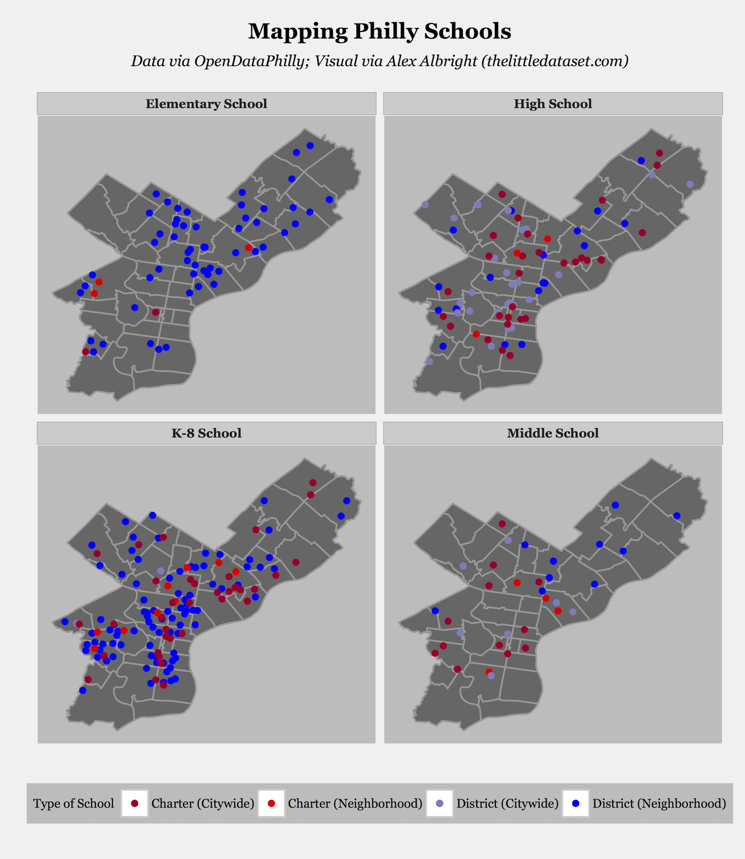
The reality is that most of the labor in creating these visuals is in figuring out both how to make functions work and how to get your data in the desired workable form. Once you’ve understood how the functions behave and you’ve reshaped your data structures, you can focus on your ggplot2 command, which is the cool piece of your script that you want to show off at the end of the day:
ggplot() + geom_map(data = spr1, aes(map_id = Zip.Code),
    map = np_dist, fill="gray40", color="gray60") +
  expand_limits(x = np_dist$long, y = np_dist$lat)+
  my_theme()+
  geom_point(data=datadistn, aes(x=X, y=Y, col="District (Neighborhood)"),
    size=1.5, alpha=1)+
  geom_point(data=datachartn, aes(x=X, y=Y, col="Charter (Neighborhood)"),
    size=1.5, alpha=1)+
  geom_point(data=datadistc, aes(x=X, y=Y, col="District (Citywide)"),
    size=1.5, alpha=1)+
  geom_point(data=datachartc, aes(x=X, y=Y, col="Charter (Citywide)"),
    size=1.5, alpha=1)+
  facet_wrap(~Rpt.Type.Long, ncol=2)+
  ggtitle(expression(atop(bold("Mapping Philly Schools"),
    atop(italic("Data via OpenDataPhilly;
    Visual via Alex Albright  (thelittledataset.com)"),""))))+
  scale_colour_manual(values = c("Charter (Citywide)"="#b10026",
    "District (Citywide)"="#807dba","Charter (Neighborhood)"="red",
    "District (Neighborhood)"="blue"), guide_legend(title="Type of School"))+
  labs(y="", x="")
This command creates the map I had previously presented. The basic process with all these sorts of ggplot2 commands is that you want to start your plot with ggplot() and then add layers with additional commands (after each +). The above code uses a number of functions and geometric objects that I identify and describe below:
ggplot(): Start the plotgeom_map(): Geometric object that maps out Philadelphia with the zip code linesmy_theme(): My customized function that defines style of my visuals (defines plot background, font styles, spacing, etc.)geom_point(): Geometric object that adds the points onto the base layer of the map (I use it four times since I want to do this for each of the four school types using different colors)facet_wrap(): Function that says we want four different maps in order to show one for each of the four school levels (Middle School, Elementary School, High School, K-8 School)ggtitle(): Function that specifies the overarching plot titlescale_colour_manual(): Function that maps values of school types to specific aesthetic values (in our case, colors!)labs(): Function to change axis labels and legend titles – I use it to get rid of default axes labels for the overarching graph
Definitely head to the full R script on Github to understand what the arguments (spr1, np_dist, etc.) are in the different pieces of this large aggregated command.4
Visualization #2: Violin Plots
My second creation illustrates the distribution of school scores across the four aforementioned school types: Charter (Neighborhood), Charter (Citywide), District (Neighborhood), and District (Citywide).5 To explore this topic, I create violin plots, which can be thought of as sideways density plots, which can in turn be thought of as smooth histograms.6 Alternatively, according to Nathan Yau, you can think of them as the “lovechild between a density plot and a box-and-whisker plot.” Similar to how in the previous graph I broke the school plotting up into four categories based on level of schooling, I now break the plotting up based on score type: overall, achievement, progress, and climate. See below for the final product:
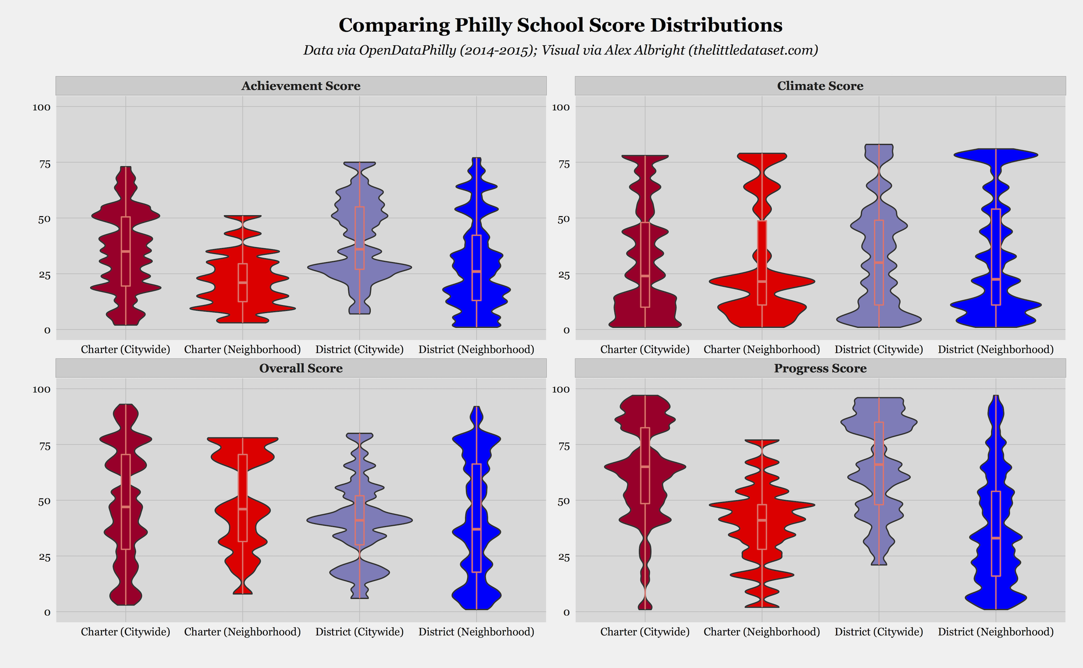
The core command that yields this graph is as follows:
ggplot(data_new, aes(factor(data_new$Governance0), data_new$Score))+
  geom_violin(trim=T, adjust=.2, aes(fill=Governance0))+
  geom_boxplot(width=0.1, aes(fill=Governance0, color="orange"))+
  my_theme()+
  scale_fill_manual(values = pal2, guide_legend(title="School Type")) +
  ylim(0,100)+
  labs(x="", y="")+
  facet_wrap(~Score_type, ncol=2, scales="free")+
  ggtitle(expression(atop(bold("Comparing Philly School Score Distributions"),
    atop(italic("Data via OpenDataPhilly (2014-2015);
    Visual via Alex Albright (thelittledataset.com)"),""))))
Similar to before, I will briefly explain the functions and objects that we combine to into this one long command:
ggplot(): Begin the plot with aesthetics for score and school type (Governance0)geom_violin(): Geometric object that specifies that we are going to use a violin plot for the distributions (also decides on the bandwidth parameter)geom_boxplot(): Geometric object that generates a basic boxplot over the violin plot (so we can get an alternative view of the underlying data points)my_theme(): My customized function that defines the style of visualsscale_fill_manual(): Function that fills in the color of the violins by school typeylim(): Short-hand function to set y-axis to always show 0-100 valueslabs(): Function to get rid of default axes labelsfacet_wrap(): Function that separates plots out into one for each of the four score types: overall, achievement, progress, climateggtitle(): Specifies the overarching plot title
Again, definitely head to the full R script to understand the full context of this command and the structure of the underlying data.7
Wrapping up
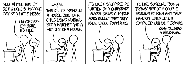
It took me many iterations of code to get to the current builds that you can see on Github, especially since I am not an expert with mapping – unlike my better half, Sarah Michael Levine. See the below comic for an accurate depiction of current-day-me (the stick figure with ponytail) looking at the code that July-2015-me originally wrote to produce some variant of these visuals (stick figure without ponytail):
Hopefully current-day-me was able to improve the style to the extent that it is now readable to the general public. Moreover, in intensively editing code created by my past self over the past string of days, I also quickly recalled that the previous graphical representation of my project workflow needed to be updated to more accurately reflect reality:
On a more serious note, city open data is an incredible resource for individuals to practice using R (or other software). In rummaging around city variables and values, you can maintain a sense of connection to your community while floating around the confines of a simple two-dimensional command line.
Code
If you’d like to replicate elements of this project, see my Github repo.
Plugs
- Thanks to Sivahn for communicating with me about her Charter Wars documentary webseries project–good luck with the screening and all, Si!
- If you like city open data projects, or you’re a New Yorker, or both… check out Ben Wellington’s blog that focuses on NYC open data.
-
Plug: Sivahn Barsade will be screening her documentary webseries Charter Wars this weekend in Philadelphia! Check it out if you’re around. ↩︎
-
Check out the intertwined and state-of-the-art Dobbie-Fryer (2013) and Fryer (2014) if you’re interested in charter school best practices and their implementation in other school environments. Yes, that’s right; I’m linking you to the full pdfs that I downloaded with my university access. Think of me as Robin Hood with the caveat that I dole out journal articles instead of $. ↩︎
-
Note from Si on four school categories: While most people, and researchers, divide public schools into charter-run and district-run, this binary is lacking vital information. For some district and charter schools, students have to apply and be selected to attend. It wouldn’t be fair to compare a charter school to a district magnet school just like it wouldn’t be fair to compare a performing arts charter school to a neighborhood district school (this is not a knock against special admit schools, just their effect on data analysis). The additional categories don’t allow for a perfect apples-apples comparison, but at least inform you’ll know that you’re comparing an apple to an orange. ↩︎
-
Recommended resources for those interested in using R for visualization purposes: a great cheat sheet on building up plots with ggplot2 & the incredible collection of FlowingData tutorials; Prabhas Pokharel’s helpful post on this type of mapping in R. ↩︎
-
Note that the colors match those used for the points in the previous maps. ↩︎
-
The efficacy or legitimacy of this sort of visualization method is potentially contentious in the data visualization community, so I’m happy to hear critiques/suggestions – especially with respect to best practices for determining bandwidth parameters! ↩︎
-
Relevant resources for looking into violin plots in R can also be found here and here. ↩︎