Motivation
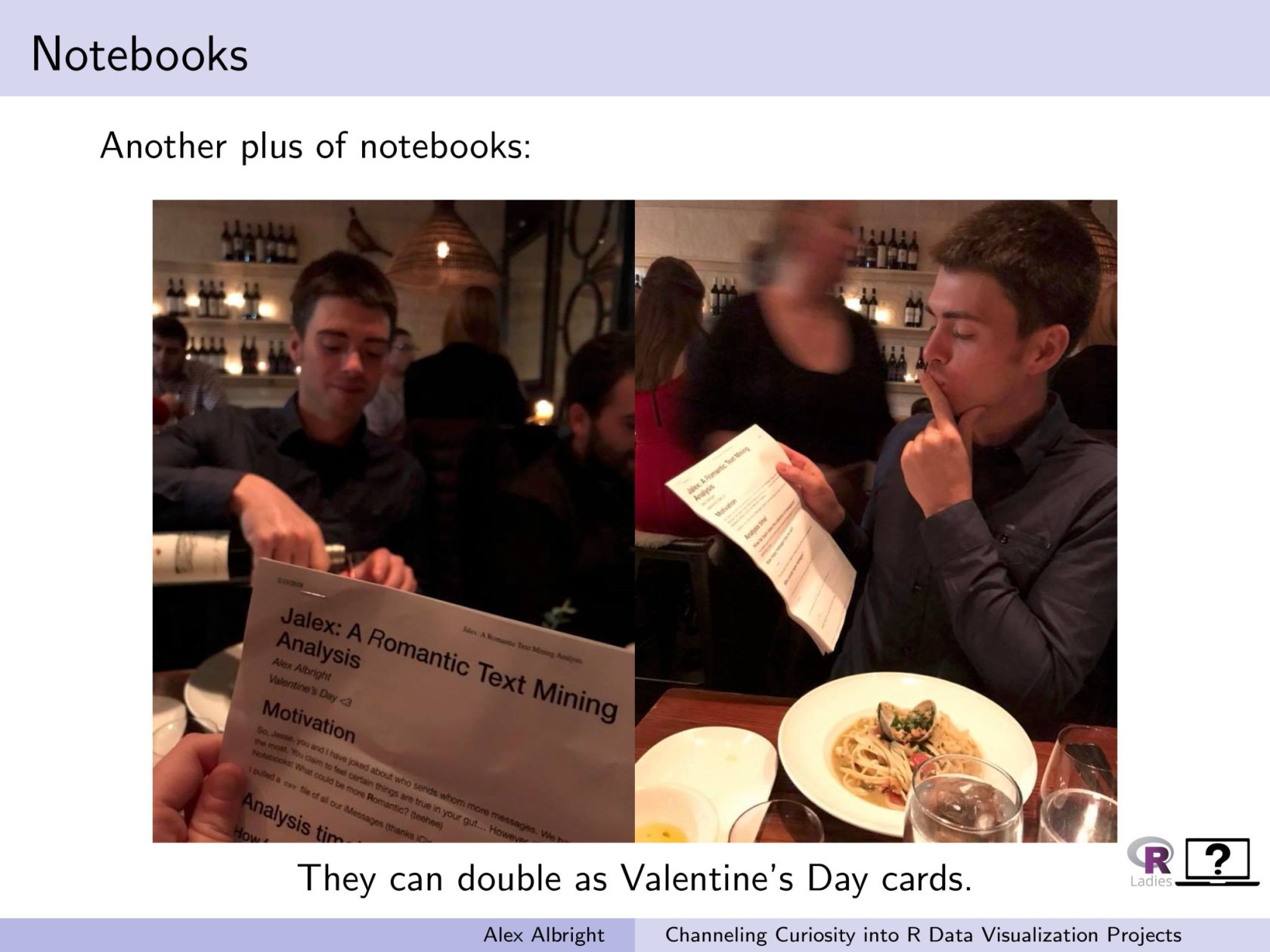
I spent some time in February figuring out how to download my iMessage data.1 The idea was that I could then use that data to make Jesse an R Notebook Valentine. And it worked!

That Valentine was an investigation into word usage (via tf-idf) and emotional tinges in messages (via sentiment dictionaries). I treated all the messages as two aggregated blocks (one from Jesse, one from me) and was not concerned with the time dimension (when messages were sent). However, I’ve regularly hypothesized to Jesse that I know exactly what a graph of our iMessages would look like over time.
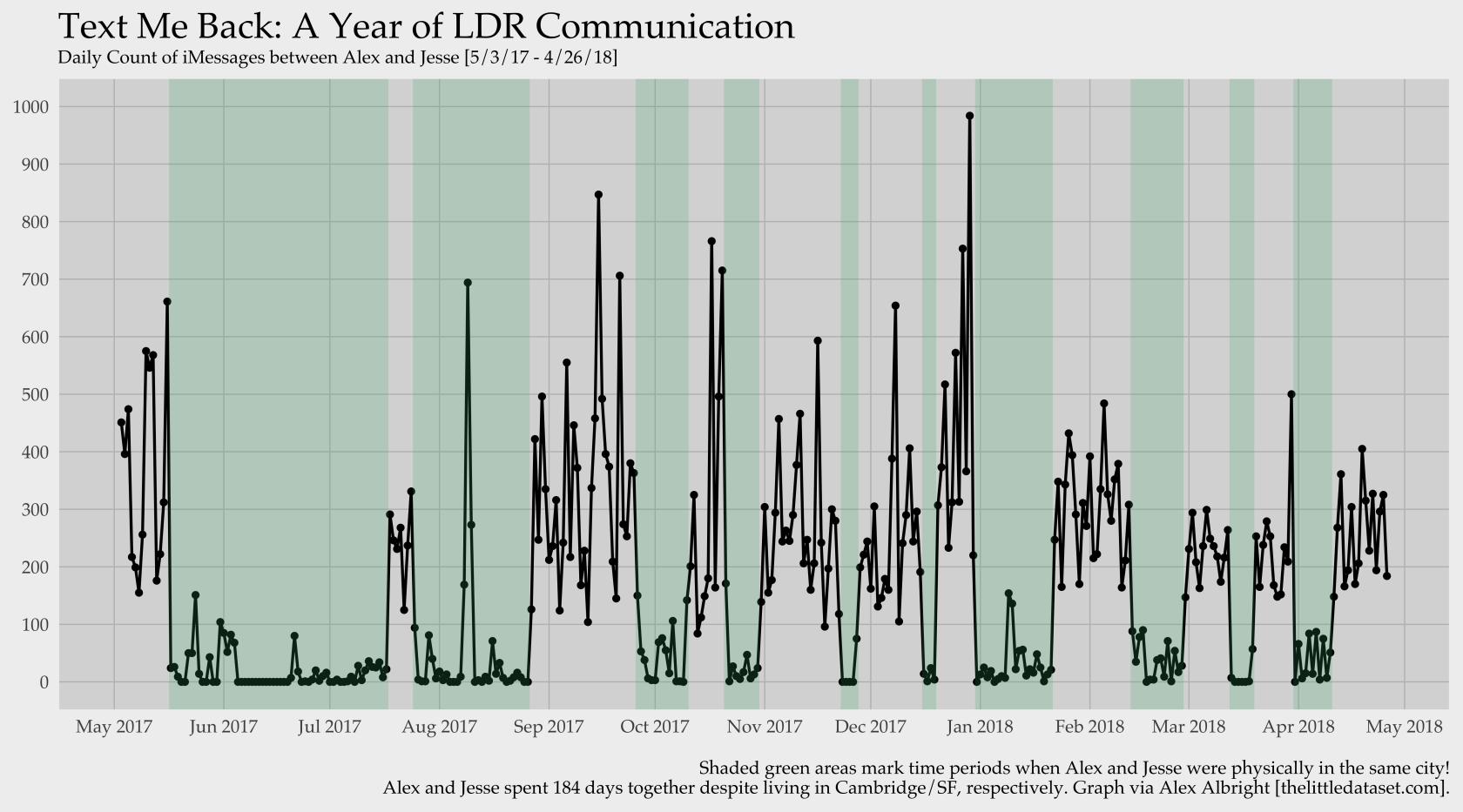
Why’s that? Well, Jesse and I are in a LDR, which means we are accustomed to going weeks without seeing each other. When you live with your SO, you come home to the same place. There isn’t a ton of need to send messages about your day, as you’ll see them soon and can update them later. When you live across the country, you share text update frequently since you might not catch up over phone/video for a few days. Pretty intuitive, right? So, my hypothesis was this: message frequency is ridiculously inversely correlated with being in the same city.2
Visually testing my hypothesis
To test this I wanted to plot the number of daily messages between us over the recent year and then mark time periods whether we were in fact in the same place or not.3 Turns out, yes, you can perfectly identify when we are in the same city by plotting our daily iMessage frequency!

I am very proud of this visual since it fits my hypothesis perfectly and is a succinct visual story about our virtual communication. Beyond the aesthetics, it also depicts an important part of my life that often is invisible to people. So, I am proud to own both the graph and the reality it depicts.
Relevant to recent concerns about data privacy, Brianna McHorse pointed out that this visual is also an example of how effectively and easily inferences can be made using personal data. I think that’s an incredibly powerful point. Jesse and I obviously didn’t intend to map out our visit schedule with our messaging. But, the picture of our time together/apart is loud and clear nonetheless.
On a final, humbled note, I am very thankful to live in a time and place where I have the technology to keep so significantly in touch with someone on the other side of the country despite our physical distance.
Still, I can’t wait to be back in the green.
Technical Notes
If you’d like to download your own iMessage data, it’s very simple!4 Necessary steps are explained at the start of this R notebook, which also includes all code necessary to make a similar plot.
Major props go to Aaron Parecki for building the command machinery used in the data extraction process.
-
Want to download your own iMessage data? Follow the steps at the start of this R notebook. ↩︎
-
I.e., together, message number low; apart, message number high. ↩︎
-
It could also be informative to plot daily totals of words (or maybe characters?) sent over iMessage since many messages are emojis, a few words, and reactions to other messages. Ah, to be a millennial. ↩︎
-
Though it did take me a while to figure out and piece together a full protocol back in February – thanks to Gulya and Bad Memes et al. for help. ↩︎