The gift of Fitbit data1
Jesse had been asking me for a while if I wanted a Fitbit… When the subject came up again in October, I was pretty sure I knew what I’d get for my birthday in November. That was back in 2018, which means that I’ve been wearing this lil device on my wrist for well over a year now. I initially thought that I’d get really into tracking my steps, but it turns out that my interest in active time paled in comparison to my interest in one particular kind of inactive time: sleep. 😴 😴 😴
Now, on mornings when I find myself pulled out of a dreamscape by the sound of whatever song has recently been promoted2 to alarm music, I often say something like,
Oh, I was totally in REM.
I’ll then check my sleep summary and say, to no one in particular,
I knew it.
After a staggering 425 days of annoying Jesse with hot takes on my sleep cycles, I decided it was time to export my entire account archive and dig into the raw sleep data. Since time and space around sleep are inherently fuzzy – my conscious self can’t be sure when it took off for the evening – I want to use my data to have a better sense of the daily patterns of my unconscious self. Specifically, I’ll use some new (to me) visualization methods + R packages3. Here’s a twitter thread on some very useful resources from the conference.] to address the questions: (1) how much do I sleep? and (2) when do I sleep?
Hopefully this exercise provides some guidance/ideas to others who want to dig into their Fitbit data as well as an array of approaches to visualizing events (sleep, in this case) over time.
(1) How much?
My archive includes 456 sleep events recorded over 425 days.4 Since I’m curious about how much I sleep per day, I work with Fitbit’s minutesAsleep variable to plot the distribution of “hours asleep per day” with the below histogram (the bins are 30 minute increments).5
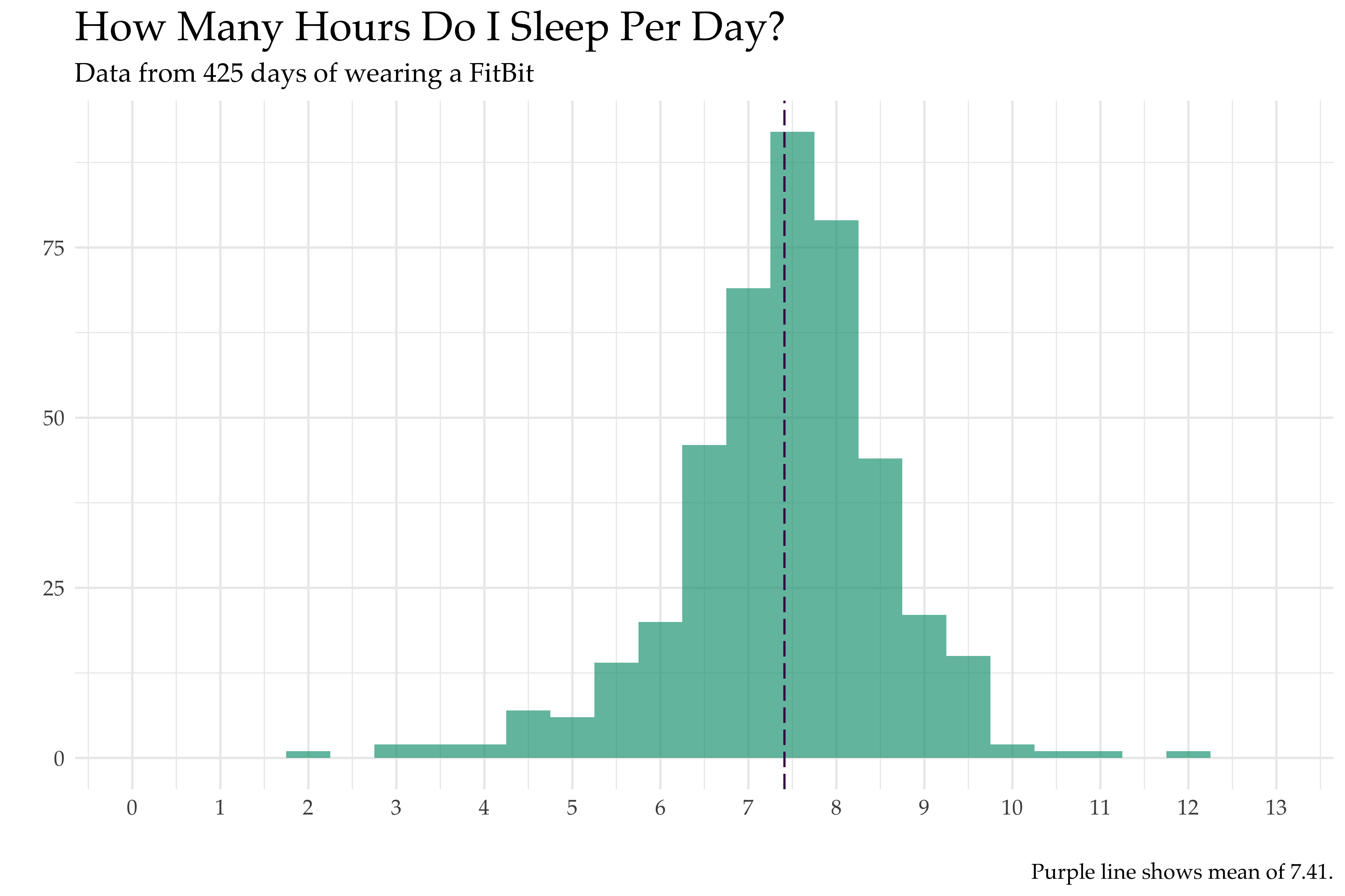
While there were a few brutal 2-4 hour days (often due to early flight bookings I made to save money but later regretted) and glorious 10-12 hour days (often during Thanksgiving/Christmas break), I sleep an average of 7.41 hours per day. I get the recommended 7 hours per day (or more) about 70% of the time.6
(2) When??
With the amount quickly pinned down, I move onto the more interesting question: when during the day do I sleep? I generally think of myself as a night owl – it’s easy for me to accidentally stay up until 2am… but it is quite difficult to get up before 8am. While I constantly say that causal inference is hard, those two are probably related.
To answer this question, I first want to display at the distribution of times when I fall asleep and wake up. (For everything that follows I’ve rounded times to their nearest 30 minute increment.) Since hours in the day are mod 24 (they loop around), this is a great opportunity to use polar coordinates for visual representation. I plot both distributions with a nightingale graph below – the purple bars show the frequency of times for falling asleep and the green bars show the frequency of times for waking up.
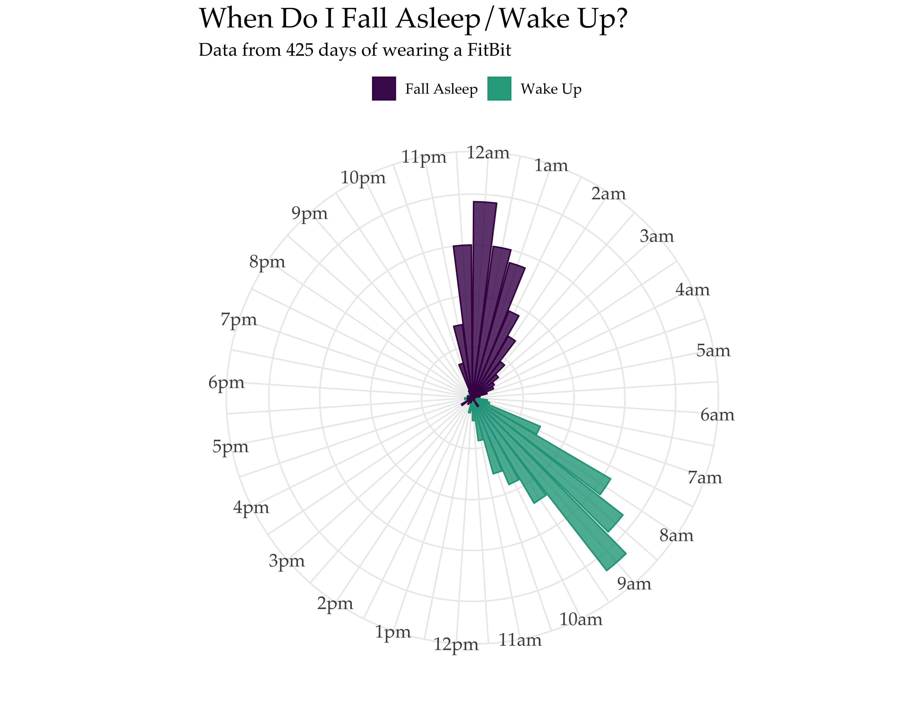
I generally go to sleep between 11:30pm-1am and wake up between 8am-9am, which aligns well with my prior expectations. However, it was surprising to me that it’s equally likely that I’m going to bed at 2am as it is that I’m going to bed at 11pm… I’d like to argue that this is because I’m often on PST even when I’m not in California. (Jesse, I blame you.)
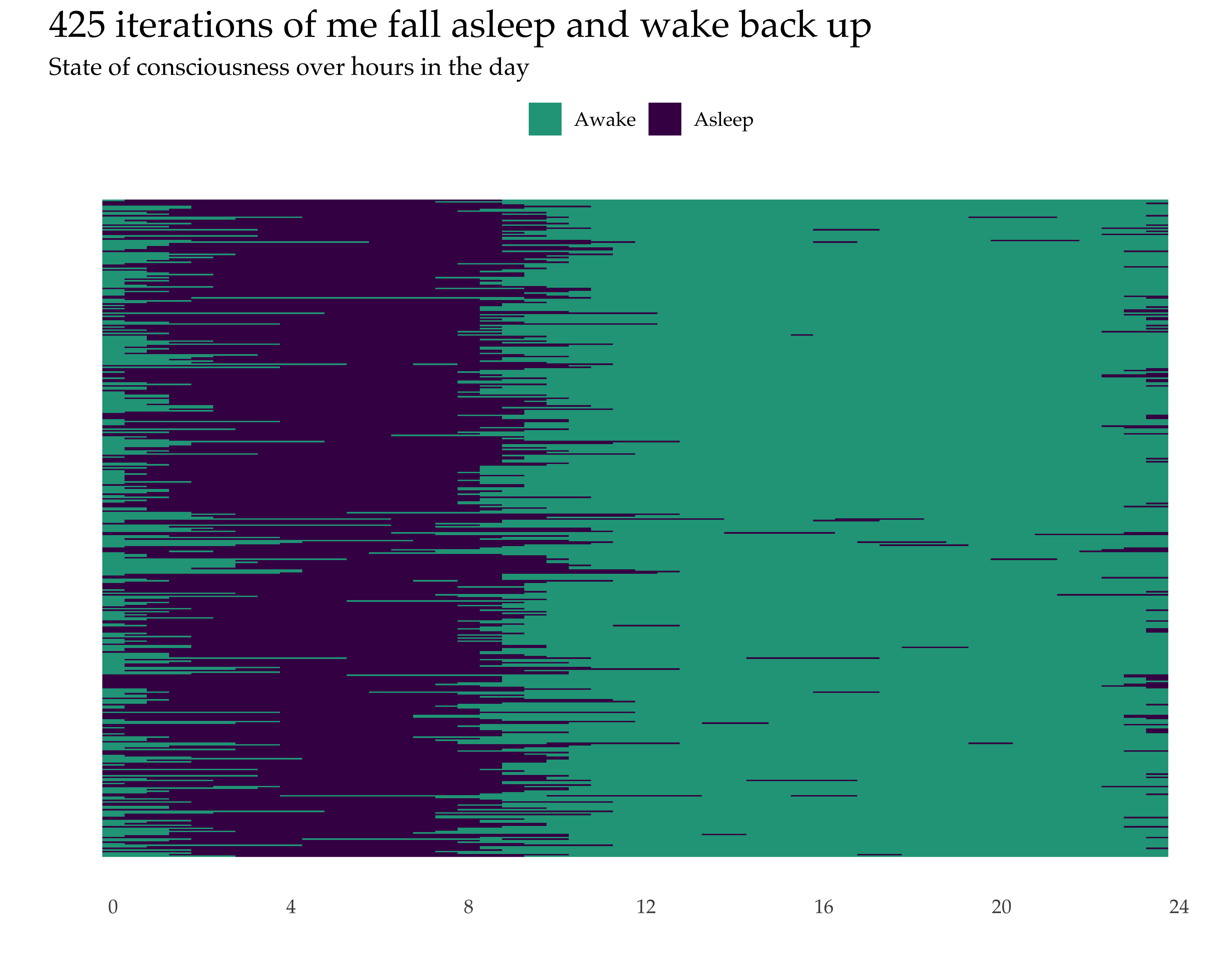
While my original “when do I sleep” question is well answered by the above visual, I wanted to use the same data to explore a few new visualization techniques. For instance, I was inspired by Nick Strayer’s great blog post that uses R to play with Fitbit heart rate data to make a “raster plot”.
The idea, as applied to my data, means that each horizontal strip is a day in my life (as recorded by Fitbit) and the colors of the the strip indicate if I was asleep or awake at a given hour. The strips start and end at midnight (aka hour 0).7 This is also very similar in concept to “The Sleep Blanket” created (and literally knit8) by Seung Lee.
Lastly, the structuring of the data for the raster plot (observations by day showing sleep/awake status over time within day) made me think of Nathan Yau’s fantastic moving bubbles chart using data from the American Time Use Survey. I wanted to see if I could make similar visual in R where each bubble is one day’s observation and the movement is across different states of consciousness.9 So, I built an animation with the R package gganimate!10 While Nathan’s data visualization shows movement over activities by time in the day over 1,000 Americans, mine shows movement over activities (sleep only) for 425 different versions of the same person (me).
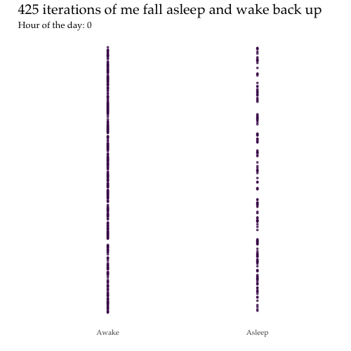
While you can see large batches of my past selves head to sleep and/or wake up in unison, this genre of visual also highlights those rare days that featured waking up at 4am in the form of pesky dots that diverge from the crowd and literally hop out of line… Go be free! (But also, please get some sleep.)
Data/Code
- OK, I’m definitely not sharing my raw Fitbit data online11 but you can export a complete archive of your own Fitbit account data by following the steps here.
- Here is my R notebook for this post, which explains which files to call from a full downloaded Fitbit archive as well as how to make these visuals.
- Here is my Github repo.
-
Alternative title to this post: “Sleep Yes More” ↩︎
-
Or demoted, depending on how you see it. ↩︎
-
A lot of edits on my code and the plot styling were inspired by talks I attended at rstudio::conf. ↩︎
-
So, defining a nap as the
$n$-th sleep event in a day with$n>1$, there are 31 naps in the data. 😄 ↩︎ -
Note: Fitbit’s record of
minutesAsleepis different thanwake_up_time-bed_timesinceminutesAsleepexcludes minutes when you’re awake during your sleep event. So, “fitbit sleep”, as I call it, is always bound above by a clock-based sleep estimate. ↩︎ -
I can also tell you empirically that I usually start to feel tired if I get less than 6.5 hours, which only happens only about 18% of the time. ↩︎
-
Really, it’d be great to loop these around into a big donut to better represent time, like how I did in the previous plot… but I don’t think you can use polar coordinates with a raster plot. Open to thoughts on this! ↩︎
-
not
knitrmarkdown-style. ↩︎ -
Nathan has a tutorial on how to make these charts here but I don’t believe it’s in R. ↩︎
-
Here’s a useful primer on
gganimate. PS: code suggestions on how to improve my final product are very welcome! ↩︎ -
because my internal IRB tells me that the pros of reproducibility don’t outweigh the costs of the loss of privacy to the subject… me ↩︎