My partner Jesse runs programs for an org called Bay Area Disc Association (BADA). This means that in normal times his job is organizing large (very large) groups of people to play ultimate frisbee in leagues and tournaments. Those events mean hard breathing, high-fives, huddles, everyone touching the same frisbee – you know, things that were regular in January that now sound (how do I put this…) horrifying in the content context of COVID-19. So, unsurprisingly and responsibly, BADA has not been running frisbee programs for 8 months now.1
Back in June, Jesse – suddenly quite interested in talking to me about graphs now that they often convey information about a deadly pandemic2 – asked if I could make a graph showing the drop in BADA’s registration numbers in March.3 Here’s an approximate transcript of the conversation:
Jesse: What do you think? Could you spend some spare time making graphs for us?
Me: What gives you the idea I want to do that?
Jesse: …
Me: JK, I definitely want to do that. You have clean registration data I can use?
Jesse: Yes. We can just download it.
Me: OK, you have clean ready-to-download data. I don’t have to request it from anyone? I don’t have to go through an IRB process? You’re just giving it to me?
Jesse: Yup.
Me: Sold.
So, some evening(s) when Jesse cooked me dinner, I repaid his domestic labor with data visualization hours. The goal here was to show the decline in registrations. While plotting registrations over time is simple, any time series data with lots of seasonality (some seasons are bigger for ultimate registrations than others) yields a handful of visualization options. (I’m sure at the point where I explained that this 1 task could actually be 10 tasks, Jesse wondered if he had made a mistake asking me for help.)
Getting into BADAta
First, I simply show the number of program registrations by each month-year over time (Jan 2017-present). Millhouse throwing a frisbee by himself marks the drop down to ~0 due to COVID-19. The slight uptick in recent months is due to COVID-19-safe programming like the Household Throwing Challenge (within households) or BADA Bootcamp (masked, outside, distanced).
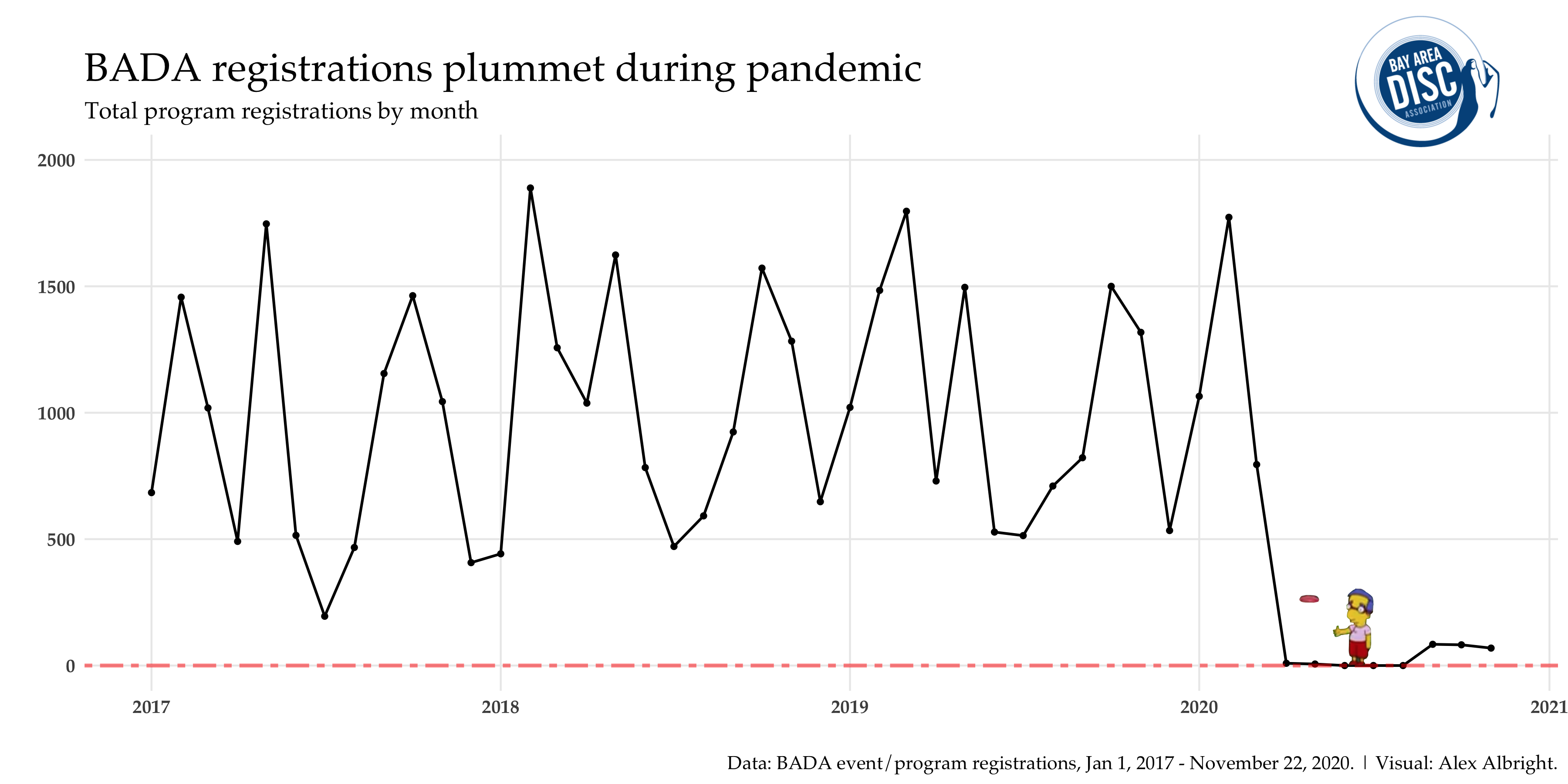
While the decline in the last 8 months is clear from this visual, it’s not as stark or clear as it could be. This is because of the fact that vast seasonality (e.g., February is always a high month for registrations and July is always a low month for registrations) distracts the eye from the drop. There’s a few different ways to deal with seasonality in contexts like this. I’ll run us through 3 of them:
- plotting within-year trends (looking month-to-month across years)
- plotting percent changes by month (calculating 2020 changes relative to previous years)
- plotting residuals after allowing for month fixed effects (de-meaning by month averages)
1. Within-year trends
Instead of plotting the full range of time on the x-axis, let’s compare registrations by months only and plot each year as a separate line. The blue and gray lines for (2017-2019) show that there’s a clear pattern in registrations over the prior non-2020 years. In 2020, things look good (in line with prior time series) for January and February but then start to drop in March and are completely down by April.
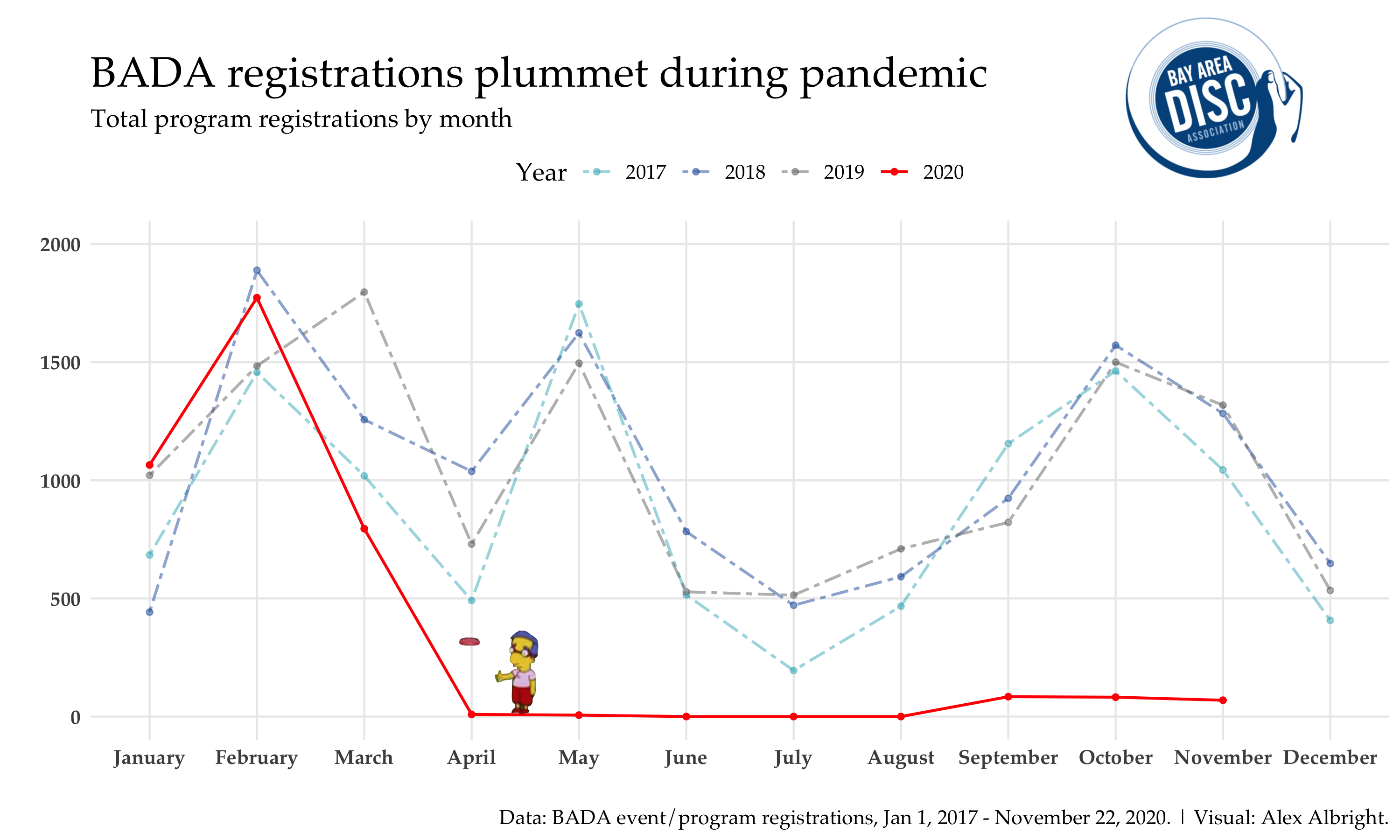
What’s cool (in my opinion) about this visual is that it’s actually exactly the same data points as in the first graph but with years separated and then overlaid on top of each other.
Example of this method in the news: This Science article explains that faculty job openings are down 70% compared to last year and plots job posting by month across years.4
2. Percent changes
Rather than showing pre-COVID-19 and post-COVID-19 time periods together, we could simply calculate percentage changes for a “year-over-year (YOY) approach.” The idea here is to define some baseline registration count by month and then compare the 2020 time series to that. In my case, I define baseline as the average by month for the 2017-2019 data (but you could also just focus on 2019, which is pretty common for COVID-19 YOY plots). As such, I plot for each month,
$$\frac{registrations_{2020} - \frac{\sum_{2017-2019} registrations}{3}}{\frac{\sum_{2017-2019} registrations}{3}} \times 100$$
This is the plot type that Jesse ended up picking for the original BADA blog post back in June.
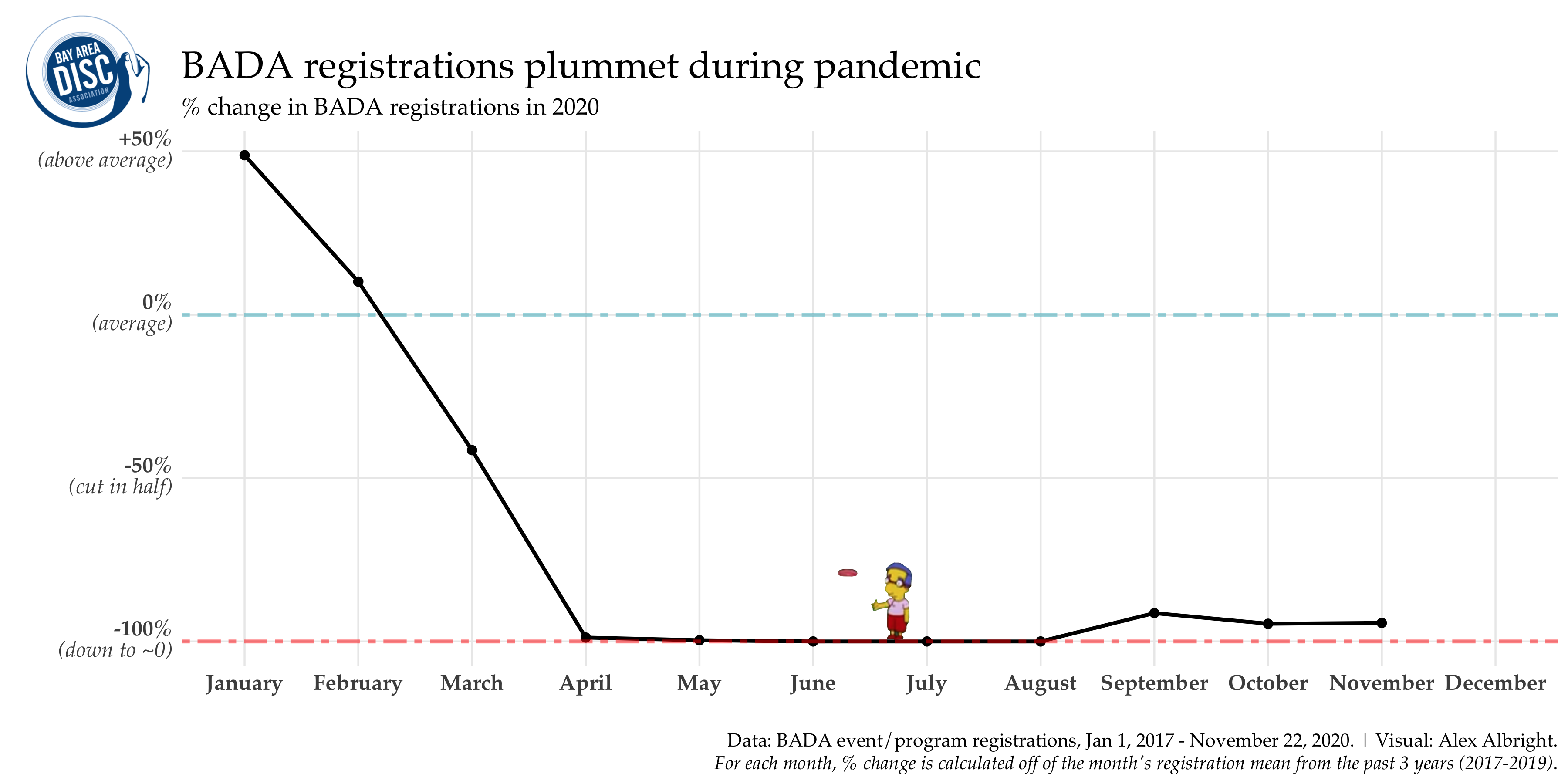
While BADA was overperforming in January and February, registrations were cut in half in March and then down almost 100% from April until today. What’s nice about this method is that it gives us the ability to give concise descriptives like “Y [quantity of interest] in M [month] is down X% relative to prior years”.5
Example of this method in the news: This NYTimes article shows visits to businesses in 2020 vs. visits to businesses in 2019 with a YOY plot (for March-August).6
3. Residualizing (with month fixed-effects)
This method is more familiar to the economics/policy/quant crowd, but it’s pretty simple once you remove the fancy lingo. The idea here is to adjust for monthly variations by “removing month fixed effects”. Essentially, registrations for month $m$ and year $y$, $registrations_{m,y}$, are a function of the month fixed effect, $\overline{registrations_m}$, and then some residual, $\epsilon_{m,y}$.
$$registrations_{m,y}=\overline{registrations_m} + \epsilon_{m,y}$$
In Gelman, Hill, Vehtari lingo, this allows us to “compare within groups (months) using varying intercept models.”7 By setting a different intercept for each month (different fixed effects), we then plot all the still unexplained variation (residuals) for each month-year. This is equivalent to de-meaning the data (subtracting out the monthly averages).
If you’ve spent the last few years in economics seminars, audience members will often want to see time series data without all that seasonal messiness. Here’s what I get for the BADA data:
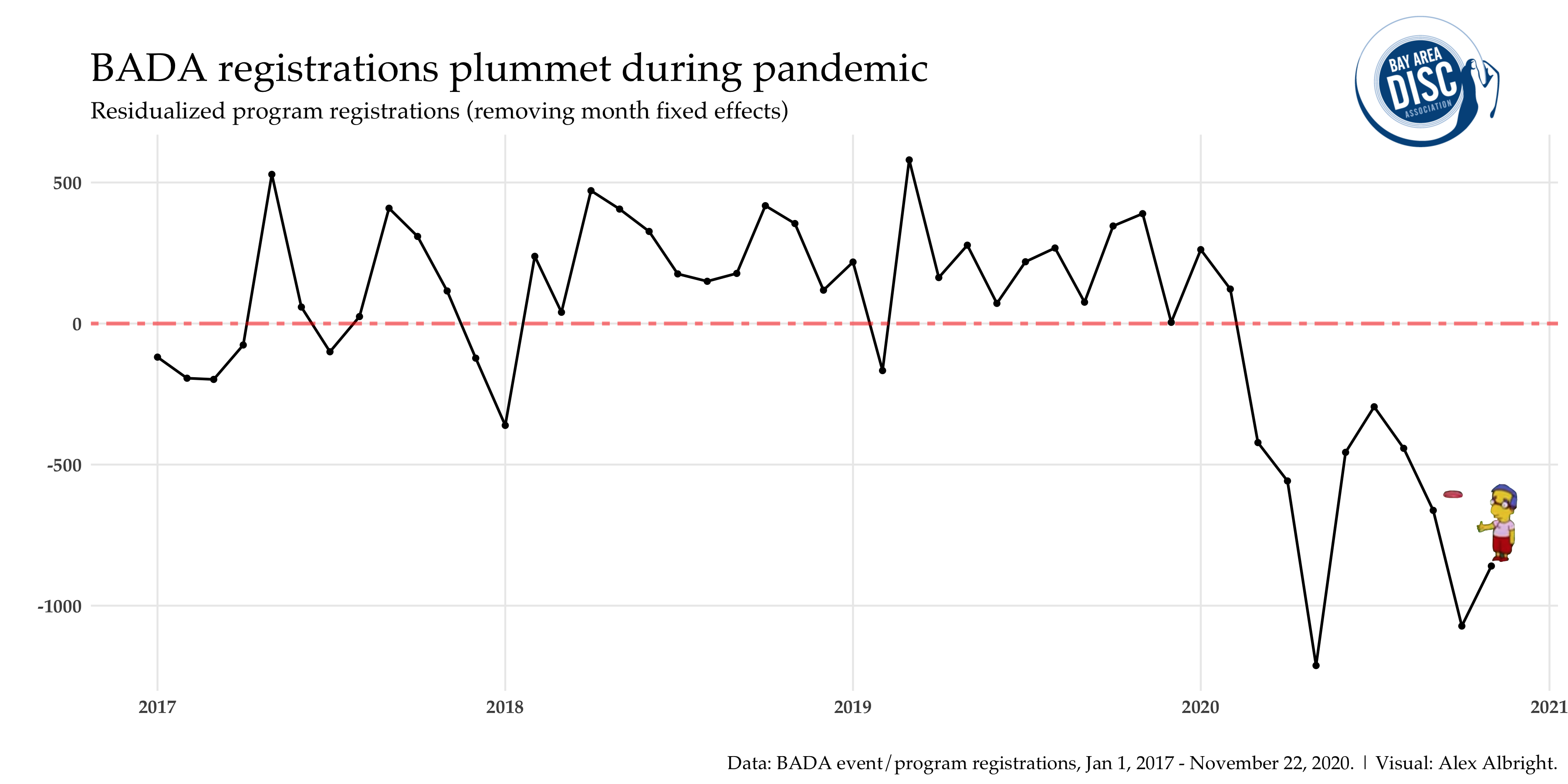
The plot again makes the point that there’s a dramatic drop after February. The negative values are the largest in May and October, which makes sense because recall in looking at the prior within-year graph that these are the two months (after February) with the largest registration totals normally (in 2017-2019).
This plotting method isn’t a data journalism go-to (like the prior two), but you’ll have to take my word for it that this is very standard in econ/policy seminars. At the end of the day, this is another way to home in on the time variation of interest (variation due to COVID-19 timing) by neutralizing other time variation (regular variation by month).
BADA back better
Thanks to my Data Provider, BADA, for the data used in this post.
Quick plug: check out the “We are BADA” year-end fundraiser.
Without the regular program revenues (I mean, did you see all the graphs?!), 2020 has obviously been a challenging year for organizations like BADA. BADA explains that campaign donations are for:
- [Implementing] new racial and gender equity initiatives
- [Providing] grassroots organizers the tools they need to safely run programs
- [Removing] barriers for new and returning players to access our sport
It is not enough for our sport to return to what it once was.
Or in Joe Biden’s words, “BADA back better”(?)
Data/Code
- Since BADA’s internal data is not public, I’m not sharing the raw data online. Hopefully the code is useful even without the raw data it calls!
- Here is my R notebook for this post, which shows different ways of visualizing the same drop in registrations (same story, different method of summarizing the data).
- Here is my Github repo for this project.
-
For more on this decision, you can read Dr. Harris Masket’s blog post about being safe and not playing ultimate. ↩︎
-
Seriously this boy is looking at way more graphs than before. In all seriousness, this is a thing beyond just Jesse. Check out how Datawrapper visualization views went up with COVID here. ↩︎
-
While I made the original version of these graphs in June for this BADA blog post, I didn’t get to writing this up until now. The good news on the delay is that now there are many more months of data to visualize. ↩︎
-
They even use a similar color palette across years! I mean, it definitely makes sense to group the non-2020 years together as colors and highlight 2020 with a distinct color (orange-red for both of us). ↩︎
-
Unsurprisingly, during COVID-19, many those X’s have often been pretty strikingly large. ↩︎
-
As you scroll down, they later break this out by state for a “spaghetti” style plot. ↩︎
-
They don’t like the fixed effects lingo. Fair – it is used imprecisely sometimes no doubt. ↩︎